
A magazine wants an illustration on one of the following topics:
Lost Disaster Discovery Guilty secret
They want an illustration based on a still life. You have the freedom to select the items for the still life and are given creative free rein. The rest of the content, the method you use to produce it and the colours you use are all for you to decide.
After a bit of a brainstorming, moodboard session, I decided to work with the topic "Lost". I think because I was feeling a little overwhelmed by my inadequacies with technology, I decided to search for articles that centred around being lost in the digital world or lost in technology.
When I googled this I came across three articles of interest: one in the Guardian online and one in the New York Times online. In the end I decided to combine one of the articles in the Guardian with the article in the New York times as they dealt with very similar issues but I preferred the way the NYT article presented the content but I preferred the title of the Guardian's article. Thus came the (combo) article:
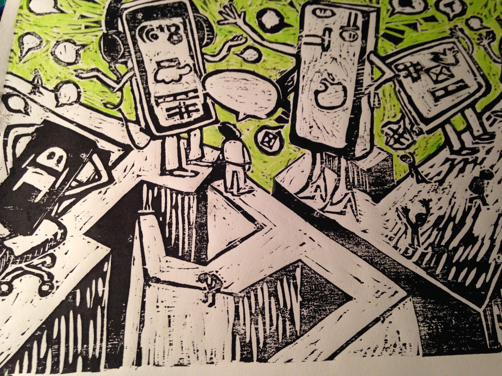
The Lost art of Communication. This article resonated with me not only because I feel a little like oil and water when it comes to relating to the virtual/technological world on ALL levels, but also because since I have been doing the course and therefore challenged to keep a sketch book and I am amazed at how often I am drawing people on some sought of tablet or mobile's touch screen, posture stooped, thumbs doing the talking, so when I saw the article I knew this was the article I wanted to use.
I did however get a little enthusiastic about the idea that I left out the step of doing the still life and launched into using the objects that I thought were guilty of the above. I decided to follow the woodcut theme that I seemed to be using for this section of work and do a woodcut version and a collage version....unfortunately I ran out of time and therefore could only do the woodcut version!


Roughs and rough colour study.
I found this print too busy and difficult to 'read'.
I didn't finish this print because the neon paint was simply spreading and dirtying the black ink and for all the effort it seemed less effective then the prints on tissue paper.
Lost Disaster Discovery Guilty secret
They want an illustration based on a still life. You have the freedom to select the items for the still life and are given creative free rein. The rest of the content, the method you use to produce it and the colours you use are all for you to decide.
After a bit of a brainstorming, moodboard session, I decided to work with the topic "Lost". I think because I was feeling a little overwhelmed by my inadequacies with technology, I decided to search for articles that centred around being lost in the digital world or lost in technology.
When I googled this I came across three articles of interest: one in the Guardian online and one in the New York Times online. In the end I decided to combine one of the articles in the Guardian with the article in the New York times as they dealt with very similar issues but I preferred the way the NYT article presented the content but I preferred the title of the Guardian's article. Thus came the (combo) article:
The Lost art of Communication. This article resonated with me not only because I feel a little like oil and water when it comes to relating to the virtual/technological world on ALL levels, but also because since I have been doing the course and therefore challenged to keep a sketch book and I am amazed at how often I am drawing people on some sought of tablet or mobile's touch screen, posture stooped, thumbs doing the talking, so when I saw the article I knew this was the article I wanted to use.
I did however get a little enthusiastic about the idea that I left out the step of doing the still life and launched into using the objects that I thought were guilty of the above. I decided to follow the woodcut theme that I seemed to be using for this section of work and do a woodcut version and a collage version....unfortunately I ran out of time and therefore could only do the woodcut version!
Roughs and rough colour study.
 |
| Half-carved wood |
 |
| Photo of prints |
 |
| Unused monoprint |
 |
| Unused print: white on black |
 |
| Unused print on white paper with neon-green painted background |
I decided to introduce white into the image but vacillated between the amount of white to include and where it should be included:
I chose to add the text which poses the question : "Dinner anyone?" I chose to add this because this question challenges us to return to communicating around the dinner table- a place often considered the foundation of family and friendship and authentic conversation across cultures internationally.


 |
| Print on green tissue paper |
 |
| print on pink tissue paper experimenting with white gouache and collage |
 |
| Green tissue with alternative white gouache on maze |
 |
| experiment with pink tissue paper collage on green tissue print |
When I was ready to work on the layout and had a look at what type of magazine my image might potentially feature in....and suddenly I realised that having not completely considered the layout prior to doing the image. Especially as after having a good look at a number of magazines, the images were predominantly portrait in layout as opposed to mine which was landscape.
I was quite frustrated with myself for not considering this earlier especially as I have had this issue with other images. Hopefully this time I will learn from it.
To finish it off I added the image to the article in a way to create a double page spread and make the most of the landscape image. It was a learning curve on using the tech bits that I constantly find a challenge but I persevered and felt that I made progress, even adding a drop quote on one of the attempts.


No comments:
Post a Comment