
Brief: You have been asked to produce an illustrated strip of up to five frames for use in schools
explaining to young teenagers how to cope with the onset of puberty. You can decide on
which aspect you want to tackle. Due to the subject matter and the intended age group
it is suggested that you use metaphor and humour when conveying the message –
though take care not to trivialise a serious message. The client would also like you to
provide a single illustration of your character for use on the front cover.
The leaflet is called What’s happening to my body? It’s all going mad!
I was absolutely not looking forward to doing this exercise mostly because of the subject matter, but the more I did it the more I ended up enjoying it. So much so that I seemed to have forgotten that the brief had specified that the strip should be up to five frames....oy! Oh no!
Apart from this I think that I learnt a lot from doing this exercise.


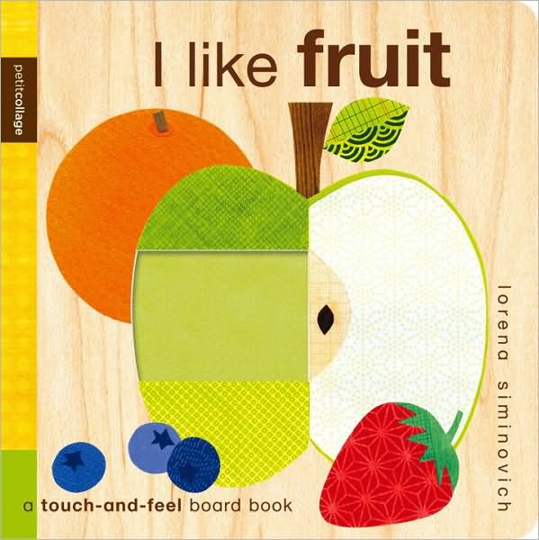
These resources were helpful but I wanted to present the information in a more contemporary yet sensitive manner. I found this image online which I think works well for giving information to both genders:


EXERCISE 5.6 WORKING WITH CHILDREN
Brief: Collect as many examples of imagery for children as possible. Group the illustrations
The leaflet is called What’s happening to my body? It’s all going mad!
I was absolutely not looking forward to doing this exercise mostly because of the subject matter, but the more I did it the more I ended up enjoying it. So much so that I seemed to have forgotten that the brief had specified that the strip should be up to five frames....oy! Oh no!
Apart from this I think that I learnt a lot from doing this exercise.
I used the Internet
primarily for my information especially the website: http://kidshealth.org/kid/grow/body_stuff/puberty.html. I also searched images of
current information regarding puberty and these are some examples:
I liked the
use of typography and was keen to use this in my own version.
I
also experimented with using a kind of graffiti type font but none of these
seemed quite right. I tried to rack my brains about tweens and what they like.
As I was tackling puberty in girls I thought specifically about them.


I tried a few versions initially creating a character which was a little more comical but found that I was only introducing humour and the image wasn't very empathic, so I decided to try my hand at creating a more sensitive character.

This took some time and experimentation but I am happy with my final character as I feel she is childlike enough for a tween to relate to and has an element of empathy...well I hope!
I tried a few versions initially creating a character which was a little more comical but found that I was only introducing humour and the image wasn't very empathic, so I decided to try my hand at creating a more sensitive character.
This took some time and experimentation but I am happy with my final character as I feel she is childlike enough for a tween to relate to and has an element of empathy...well I hope!
I wanted the pamphlet to appear as if it was someone doodling or someone’s school diary or something like that, so I decided to use school-lined paper as the background and sharpie felt tip pens for colour. I also wanted to limit the colour pallet especially as the 1st 'graffoiti' version felt a little overwhelming with colour.
Initially I did all the writing on each page in felt tip ( as they are my new love!) but found that when I reduced the images on the photocopier the lettering was too bold and too large.
As a result the writing almost implied it was targeting a younger audience then a tween.....
SO I went back to the drawing board and used a mixture of uni-pin fine liners and marker pens to create the final pamphlet.
On the whole
I am happy with the result although that is not to say some changes are not in
order!
I did some last minute market research with work colleagues who have kids who had some good constructive feedback. Overall they were positive about the pamphlet and said they would happily give it to their daughters. One colleague did comment that she felt that the page that dealt with the crux of what puberty was ie: the body changes etc should be across 2 pages as the images looked a little on top of each other. She also commented that this would mean a little more ‘helpful tips’ could also be included underneath each of these changes, which I thought was a good idea as I had only touched on things to do to help tackle these changes. Unfortunately this feedback came too little too late on this occasion but I will make the above amendments (and any other recommendations) when I hand in the work for assessment! I did manage to make 2 minor changes on the pamphlet itself as one father said the word ‘live’ looked too much like ‘dive’ so I made that clearer and another mum felt I should add that “it was all part of growing up” at the end and therefore I added this as well! So all was not completely lost but note to self….READ THE BRIEF AND DO MARKET RESEARCH EARLIER!
I did some last minute market research with work colleagues who have kids who had some good constructive feedback. Overall they were positive about the pamphlet and said they would happily give it to their daughters. One colleague did comment that she felt that the page that dealt with the crux of what puberty was ie: the body changes etc should be across 2 pages as the images looked a little on top of each other. She also commented that this would mean a little more ‘helpful tips’ could also be included underneath each of these changes, which I thought was a good idea as I had only touched on things to do to help tackle these changes. Unfortunately this feedback came too little too late on this occasion but I will make the above amendments (and any other recommendations) when I hand in the work for assessment! I did manage to make 2 minor changes on the pamphlet itself as one father said the word ‘live’ looked too much like ‘dive’ so I made that clearer and another mum felt I should add that “it was all part of growing up” at the end and therefore I added this as well! So all was not completely lost but note to self….READ THE BRIEF AND DO MARKET RESEARCH EARLIER!
EXERCISE 5.6 WORKING WITH CHILDREN
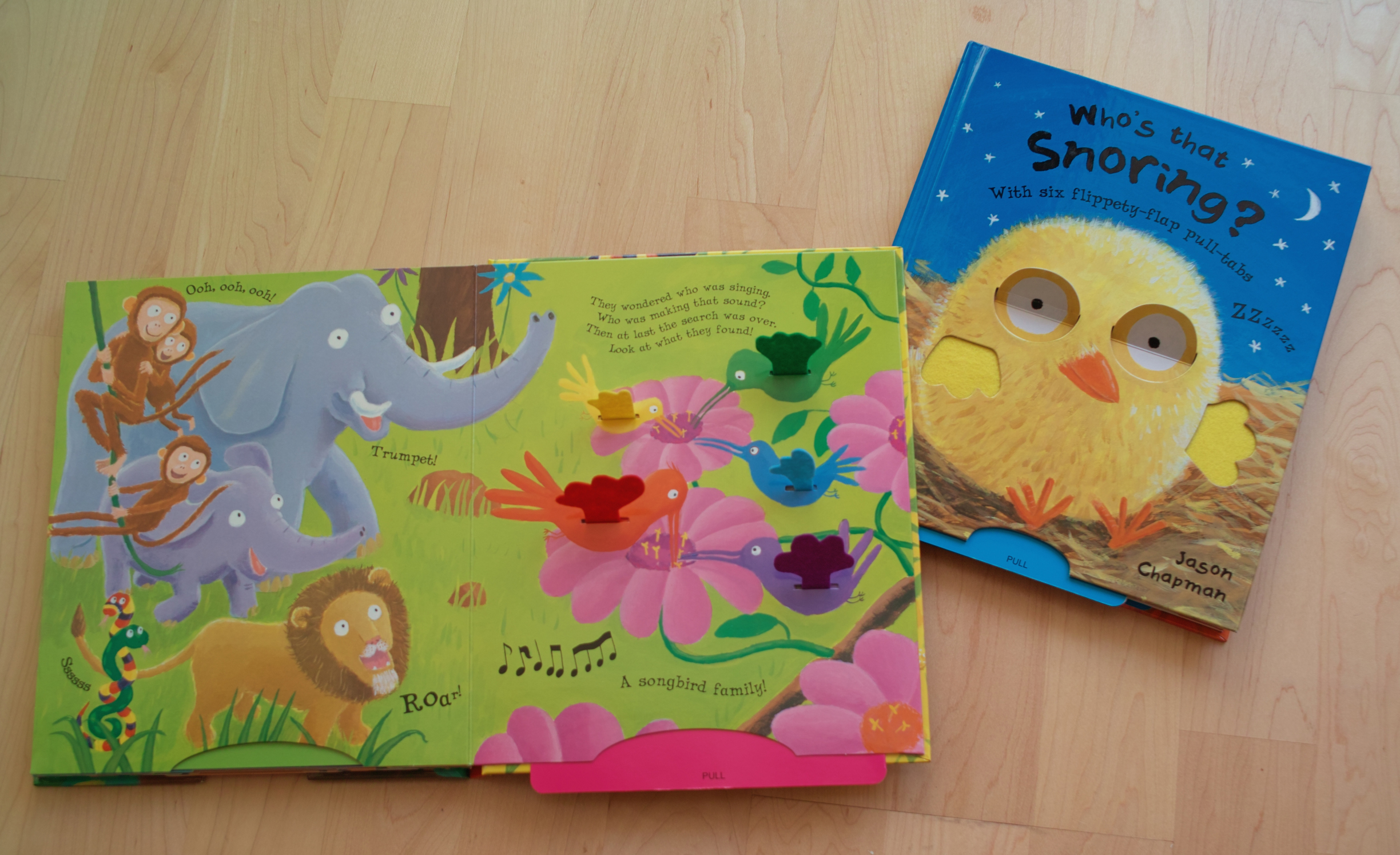
Brief: Collect as many examples of imagery for children as possible. Group the illustrations
you’ve collected into the target age groups. Include at least one image for each age group.
Pre-reader Pre-school (3–5) Early reader (5-7) Established reader (7–9) and Older age groups.
Take two of these age groups and, for each one, go through a process of brainstorming around at least one word chosen from this list:
Festival Scary Wild Growing Journey Sad Family Discovery


_cover.jpg)


.jpg)


Pre-reader Pre-school (3–5) Early reader (5-7) Established reader (7–9) and Older age groups.
Take two of these age groups and, for each one, go through a process of brainstorming around at least one word chosen from this list:
Festival Scary Wild Growing Journey Sad Family Discovery
I
found this exercise challenging simply for the perspective that I really
struggle with making such clear boundaries between age groups and picture
books. I say this because there are a number of stories I can think of simply
at the top of my head which I would read to a 2 year old pre-reader who would
love the images and the story and ready the same story to an 8yr old as a bed
time story where they may be playing a more active role in reading or just listening
to the story no matter how many times they’ve heard it. Books by Oliver Jeffers
or even the Gruffalo by Julia Donaldson are examples of this, which I have done
just this for friend’s children who fit into these two different age groups. I
also have some picture books that I cannot say was designed with a target age
group in mind and therefore span all ages. Shaun Tan’s books in general are
good examples of this e.g.: ‘The red
tree’ ,the Arrival or Eric. Even artists like Korky Paul and Babette Cole
create works of humour rather then targeting specific age groups. Their
narratives are strong enough to span across age groups.
Agata Dudek:
Dr Seuss:
Oliver Jeffers:
Of
course I can appreciate the other side of the argument and there are books that
need to be designed for certain age groups like ‘novelty’ books which look at
in essence teaching basic concepts like colour, texture etc and these concepts
should be consolidated by a 4/5yr old.
Successful books like “in the night garden” are targeting a younger
child by virtue of their narrative. I think they also started as television
characters and then became books rather then the other way around.
In
terms of bright colours, I do not feel that picture books have to be bright and
some of the best books have a very limited colour pallet both contemporary
books and older stories. In fact there seems to be a pattern of returning to a
more limited pallet echoing the colours used by people like John Lawrence or
Jack Townend. A lovely book I recently saw with a pallet of orange, blue and
black and white is called 365 penguins and it is a fabulous book. Of course
wonderful colourful books by tony Ross or the wonderful Quentin Blake are
amongst my alllll time favourites picture books!!!! I also love Sara Finelli’s
books or Agata Dudek’s work which are filled with collage and distorted images
and yet are very well received by children and adults alike.
Of
course longer novels can also be illustrated and David Roberts or Quentin Black
are examples of illustrator who produces both full colour picture books and
black and white illustrations for longer stories. E.g.: The twits by Roald Dahl
and illustrated by Quentin Blake. Again for me I would read the twits to a
child that couldn’t read and show them the black and white illustrations and
then conversely children who are older can read it for themselves.
CONFUSED.COM!!
In one way I think that picture books have few rules and the most successful
and timeless books in my mind are constantly pushing the boundaries of what is
acceptable. I think that it is becoming more acceptable that a lot can be said
within and image and with a few/no words is as important as reading long
novels. This is not to say one skill is more important then the other, rather
that they serve different purposes and therefore in my mind there is a place
for stories with fewer words and images and those with lots of words and
fewer/no or simple black and white images.
I
therefore ventured to waterstones and to our local Kemp town book shop to get a
better understanding of the age group split. As a bigger mainstream bookshop,
Waterstones tends to only separate books for 9-12 year olds and pre-readers but
the rest of the children’s section is simply “children’s sections and books are
divided into bestselling picture books etc.
 |
| Kemp town bookshop children's section |
 |
| Waterstones bookshop 9-12 yr old recommended reads |
When
I finally got to doing creating the animal I was in a state of confusion! With
SO many options and styles I suddenly felt a little overwhelmed and therefore
stumped! So in order to get me out of what felt like sinking-sand and back into
action I signed up to a lithography course with the intention of using the
course to create my animal. My main reason behind this is because I really
struggle to limit my colour pallet naturally and have a tendency to include
lots of colour. Sometimes this works, sometimes it doesn’t and sometimes it
means that the image doesn’t really stand out. Needless to say the course had
the desired effect of getting me unstuck and providing the bit of inspiration
and boundaries that I needed! The image I drew from an internet picture of an
elephant and decided not to distort it but focus on the letting the colours do
the talking. Plus the elephant itself was soooo cute that I just couldn’t
change him! ; ) In saying that I have recently discovered the wonderful work of
Marc Boutavant who has all his animal creatures walking on two legs, including
a lovely elephant character that he recently produced for a book of short
stories called “The day no one was angry”.


Sketchbook prep drawings


Sketchbook prep drawings
 |
| Coloured pencil prep drawings from internet photos |
 |
| Final Ellie: Lithograph print and coloured pencil |
I do feel that I needed to do some more drawings of animals and perhaps try one which I 'humanised' more but was really happy with my litho elephant and with the printmaking process. In retrospect I may have steered little far away from the brief about putting the animal into one of the contexts suggested i.e.: festival. .....maybe a little bit too much of adapting the brief to the image rather then the other way around. Also the litho process was verrrrrry time consuming (Of course more so because I was learning) eand of
course one has to know what they are doing and have access to presses etc. Because it was so time consuming and I was merely doing a few evenings in a short course I misjudged the length of time and therefor had to finish the ellie in blue coloured pencil rather then having time to print the second colour, ei: blue. I do however think the mixed media stands out and when comparing the litho textures etc to the coloured pencil prep drawings in my sketch book, it is more clear how the medium comes to life.
I am sure there is also a quicker digital method but at this stage anything digital or computer based does anything but save me time! Also, because I was more focused on learning the process I wasn’t really considering composition but I did consider mark making and litho I have discovered is great for mark making!
I am sure there is also a quicker digital method but at this stage anything digital or computer based does anything but save me time! Also, because I was more focused on learning the process I wasn’t really considering composition but I did consider mark making and litho I have discovered is great for mark making!
In
a nutshell I think that I have learnt from this exercise is that when it comes
to picture books the sky can be the limit!
No comments:
Post a Comment