Friday, 5 December 2014

Exe 4.2: Museum posters


Brief: You have been asked to produce three illustrations to be used as part of a series of A3
posters to publicise the museum to the following audiences:
Child aged 5–9                            Teenager (13–16)                              General adult audience 

After quite a bit of Ummmmming and arrhing about which museum to choose I decided on Kelvin Grove in Glasgow, after visiting my sister. It truly is an extraordinary museum and art gallery in one and one of the most visited museums in Europe I soon found out. 


I was a little torn between making the posters a recognisable 'family' but decided to go with it because I just felt that the more repetition or recognisable the image in any advertising capacity, the more familiar the advert becomes and human nature has a tendency to be attracted to things that are familiar in some way. 

After making this decision I started grappling with how to put this into practice! I had recently been to the VERY inspiring exhibition of Matisse's cut-outs at the Tate, and decided to use his influence to inspire the posters. 

I found the idea for the children's poster came the most easily because Kelvin grove has a number of examples of taxidermy animals and most famously it houses the Elephant " Sir Roger" and dinosaur skeletons. 


The teenager took more effort and time whereas I found choosing an artefact to appeal to teenagers the most tricky. I found myself choosing articles that were perhaps more stereotypically gender specific and so finally decided on masks as something a little more neutral. I think it helped that earlier I had played around personalising some masks in my sketchbook just playing around so this helped formulate the final idea. 


The adult poster again was a little more tricky and so I decided to go with an artefact that symbolised that the museum is intact also an art gallery and houses some beautiful and prominent artwork from the Glasgow boys to Dali. I settled on doing a 'matisse-like-stylised version of The Dali painting that hangs in Kelvin Grove called: "The Christ of St John of the Cross"

I then got down to working out the colour scheme, doing some roughs and start cutting. 
1. Kids poster: prep and colour prep


Final Kid's poster
2.) Teen poster prep and colour ideas:


Teen Poster Final

3.) Adult poster:

           
Adult poster final
The family of posters:


Do they work? 
I actually really enjoyed the process of using cut-outs! It forced me to focus on shape and colour and stylise my images. The teenage poster was a PAIN to cut-out but apart from that I think it works well as an eye catching poster.  The adult poster is probably the most controversial and perhaps I needed to reference Dali in the poster but I was cognisant of making the poster to busy. This poster is inspired almost directly by an artwork by Henri Matisse and so I'm not sure if this confuses things as he is one artist who is not actually exhibited at Kelvin Grove....apart from the controversy I think the colours work well and I feel like using Matisse's style helped me learn a little more about colour and how colours influence each other when placed next to each other etc. 
I enjoyed making the kids poster the most because it was one of this things where both the idea and the making seemed to flow easily!

Wednesday, 3 December 2014

Exe 4.1: Exploring tools and materials

It was an eye opening experience exploring illustrators and their media. From Wonderful illustrators like Isabelle Arsenault and her use of coloured pencils; to editorial artists like Thea Brown who use pencils to create portraits that are filled with emotion and texture; to watercolours by wonderful artists like Sir Quentin Blake; to the magical work of acrylic artist and mixed media artist, Brian Wildsmith; to the challenging, thought-provoking images created through the process of printmaking by Edel Rodrigues and Daniel Pudles; to the beautiful collage art of Michael Haake and Agata Dudek; to digital artists like Lo Cole and Christ Haughton and to the mixed media artwork of Marion Duchars. 
        
       Here is a taster of some of the artists and their methods that I have discovered: 

Isabelle Arsenault
                                  

I explored the editoral illustrations of Daniel Puddles and his use of woodcuts:
Daniel Pudles is a genius with his woodcuts. His images are effective not only because of his reductive method of printing and his wonderful way of limiting his colour palette so effectively. 
 

I looked at wonderful examples of Collage from Martin Haake: 


Looking at the wonderful Acrylic paintings by Olaf Hajek with his layering and bright colour pallet has challenged me to try acrylic paints as I have a tendency to stick to Gouache.
 

 With all of these wonderful illustrators explored, I decided to try my hand at redoing one of the poster designs that I did for assignment 3 in the style of Daniel Pudles and his woodcutting technique:
A) 
B.)  C.) 

D.)  E.) 


I learnt a lot doing woodcuts for the 1st time. In terms of the process I tried to get the texture of the wood to add to the images the way that Daniel Pudles does, but I didn't manage to achieve this effect at all. I can only put it down to lack of experience and thus the need for practise! I also think that I may need to re-look at the actual wood that I used because it may have not been the quality of wood needed to allow for the woody texture to become part of the image. As a result it meant that although the print was identifiable as a relief print, it really could have been lino or wood and it is difficult to differentiate.

I also made a number of other mistakes and learned a number of lessons creating the prints: 
1.) I needed to plan the prints before hand because the lack of planning resulted in a lack space for the rest of the type that needed to be included. 

2.) I tried to play around with a limited pallet but this didn't always work which is evident in options (C.) and (D.) above.

3.) The other thing I found that was that the prints completed on the blue paper in white i.e : (B.) and (E.) unfortunately lost their colour when scanned but were better when they were photographed. The purple in the text in image (C.) just doesn't work 


In spite of this, I think that the prints are a step forward from the original design. I think the prints that work the most successfully are the green print (A) and white and turquoise point  (B)  


Wednesday, 29 October 2014

Back at it..a few sketchbook moments....

Having recently returned back to the UK, I haven't had much of a chance to start the next section of work but I have managed to do a few sketches in my sketchbook so decided to include them as proof that I have not been sitting idly! ; )


I have finally realised that I am allowed to add colour into my sketchbooks and  this is very freeing! 
 I am beginning to feel a little more comfortable with just diving in and starting to enjoy my sketchbook and use it for random doodles, drawing from life and preparatory studies. 

I finally started reading the next set of work and its all about developing your own style...a journey I am still very much embarking on! 


Wednesday, 9 April 2014

Assignment 3: Make a POSTER for a music event

Brief: Design an illustration for a poster for a music event. An Early Music concert, a Jazz evening or for a pop group.

I chose to do a poster for the Band (pop group) 'Of Monsters and Men.'


Video of: "Of Monsters and Men: King and Lionheart"

I really enjoyed this assignment...although I think I may have gone a little 'off piste'. 

I tried to ensure that on this assignment I was not going to overwork my final piece. In order to do this I decided to try doing completely different versions so that I didn't allow myself time to overwork one version and therefore I tried to maintain a degree of spontaneity.  

I started by researching a brief history of the poster and became aware of the wonderful work of Henri Toulouse-Lautrec who is attributed by many as the founder of the modern poster. 


His posters are lithographs and are full of energy and movement. I love the way that he composes his images and his use of flat block colour.

I then looked at posters and gig posters to get an idea of what was effective:


Local gig in Brighton


After this I researched the band Of Monsters and Men a little more thoroughly and found out that they are in fact from Iceland and won a competition in Iceland which enabled them to be able to create an album which then became an international success! 
I have always enjoyed their music and noted the folk, story-like nature that is central to their music.  Having researched a little bit about Iceland, I can now recognise the influence that their cultural heritage has on their music and therefore I decided to include a few of these references into the final posters. I made a mood board in my learning log..which I will download after it has been reviewed by my tutor....and included ideas about the band itself, Iceland, the mythical creatures that their songs mention and of course monsters! 


I really like their current logo and when I went on their website I found they echo it a lot in their official merchandise, so I decided to do the same. 

A few pics regarding Iceland: 


I then looked for images that related to their lyrics as well as brainstorming different ideas about the logo itself:


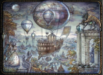
Flying ship, mentioned in song
Most of their songs mention forests/trees


Their Logo reminded me of circuit board connections
Simply a great image of very different view of a circuit board

I also thought that their logo could be packman characters

and the Monsters and crazy looking animals!!!
Maurice Sendak,Where the wild things are.
  

This is a RABBIT!!


I did a few rough drawings (Which I will scan in at a later date because I've sent them off) and then launched into doing 5 different versions.Most of the versions I have done are portrait in composition purely because 90% of the gig posters I looked at were structured this way. I did one version landscape because I figured it couldn't be against the rules.....well hopefully not! 

Version1: Northern lights
Final Northern lights
Preparatory stage


 I did this using gouache on watercolour paper and cut out the O,M's and A in tissue paper. I used Indian ink and a brush pen to do the writing.
...pity I spelt Brighton without the H!! Ohh mannnn! It was too late to correct and a valuable lesson was learnt: if I am going to hand write the lettering..I need to have full active concentration! Alternatively I should have perhaps written it on another layer e.g.: on tracing paper or of course scanned both sections in and tried to adjust digitally therefore allowing for mistakes to be corrected.
Also I did the sky using gouache which has a Matt effect and I feel that perhaps using watercolours may have provided a more translucent effect for the sky.....it may not have but perhaps worth a try if time had allowed!

Version 2: Stars
Photograph of version 1 of the stars
Scanned copy of version 2 stars
 
Photograph of version 2 of the stars

For this version I painted an A3 piece of drawing paper with black quink. Once this was dry I used a twice to apply bleach to the surface and draw on the design. 

After completing the first version I felt the text was too small for a poster and therefore did a second (very similar) version with larger text.  My Husband commented that he didn't mind the smaller text and felt that it appeared that it was emerging through the black which is also a nice thought. For me I still feel as a poster providing information, the larger text does this element better. What I did find though was this poster photographed better then it scanned which was interesting. 

This version was the quickest to create which is probably part of the reason I really enjoyed creating it! I also enjoy allowing the material to play a role in how the finished image turns out as the bleach doesn't always react uniformly. 

Version 3: Ship

Final Collage Ship version

For this version I drew inspiration from the British collage and mixed media artist, Mark Herald: 

I love the textures that he creates, his combination of printmaking processes and mixed media and his joyous use of nature as most of his primary subject matter.

This was by far my most time consuming version which entailed a lot of working into the poster and changing things around as I went along.

I played around with a variety of compositions especially whether to include the fish as I had planned initially in my rough sketch. I found that putting together the appropriate colours was very challenging in this piece, especially when it came to the text. In the end I created a predominantly diagonal composition to create a sense  of movement as well as to draw the eye to some of the information. In so saying that the yellow text re: the venue is very much horizontal to contrast the predominantly diagonal composition.
I enjoyed working in mixed media i.e.: gouache, tissue paper, ink, white paper and cut outs and I enjoyed the textures that were created between the tissue paper and paint and using a tooth brush to apply the paint for the sea as well.
I am not sure that it works the best as a poster per say though and I think it is because perhaps the colours are competing a little bit more then they should which confuses the viewer a little bit regarding where the focus of the image is. I'm not sure really...perhaps I have looked it toooooo many times!


Pencil start and 1st layer of sea paint
Sea with tissue paper and planning text

To fish or not to fish?
Trialling all cut out text on poster before sticking down with glue
               
 My original idea was to try and lino print the text onto the poster but because it taken SO long, I was running out of time and didn't want to make a mistake that would be irreparable...I decided to rather cut-out my hand-written lettering.

Version 4: Forest

This version was also one of the quickest to create for me....which always makes me partial to it! ; )

Final Forest version

Preparation step revealing masking fluid                                    
Mobile phone photograph edited on phone using Picsart app: High Definition
As demonstrated slightly above, I started off with a pencil sketch on drawing paper; I used masking fluid to protect the areas I knew I wanted white or in colour. I then painted the trees using black quink. I then painted in the colours using gouache relatively roughly and then after removing the dried masking fluid, I touched up the coloured area and some of the inked areas. 

I make the mistake of using quite a thin drawing paper which was a little too thin for these wet media and so the buckling of the paper is evident even in the scan. This is better when edited in the pics art programme on my phone so it may have been worthwhile using an image editing programme like pixelmator to tray and achieve this type of effect on the scanned original.

On the whole I enjoyed creating it. I didn't really plan where each colour should be but rather did this as I went along.  I think it is quite effective as a poster because the contrast of the bright colours against the black silhouette of the trees is eye catching. It has a stained glass window effect which was unintentional. I'm not sure if the silhouettes of the trees completely come across as well.

My final version: MONSTER version!
I decided to Lin cut this version and decided to go crazy and do it in a landscape composition.
Final Black and white monster A3 lino print

Final colour version of A3 Monsters- lino print and gouache

Wow! Did I make ALOT of silly but costly mistakes when it came to this poster! I was adamant to have at least one of poster versions done in a printmaking method and the chosen method was to make a lino cut. Unfortunately on my first cutting attempt I realised that the letters had to be a mirror image but didn't translate this into the words as well....this version below is a result of this mistake: 
Print of backwards words
I was determined to try fix this so I cut out the incorrect lino section and creating a kind of puzzle piece with the mirrored words and letters in the correct order! 

Corrected lino with new "puzzle piece of letters and words"

Unfortunately my mistakes did not end there. In my second round of printing I realised I had left out the "n" in Monsters and therefore the print read " Of MOSTERS And Men!!!!!!!" In order to prevent going to crazy with cutting even more lino, I decided to simply cut the "O" out of Mosters so that I could create a space for 2 letters using an ink pen, which I did and so the O and N are written and not printed!

I also had trouble sourcing an A3 piece of Lino and so had to work with 2xA4 sheets of lino. This meant that I had to stick the 2 pieces of lino together. Unfortunately I didn't do this flawlessly so in the prints it is a little evident where I have stuck them together. I think I need more practise in this....or I just have to make a plan to source an A3 piece of Lino!

Again I enjoyed the lino cutting process but certainly found it time consuming. ....especially because of my mistakes! 

On asking my sister and my husband for their opinions on the 2 posters they felt worked the best, they differed from each other and from me! My sister chose the Northern lights version and the ship. My husband chose the Forest and the monsters and I felt that the forest and the star version worked best as posters! So I decided in the end not to choose...which I'm not sure if I'm allowed to do.... but rather await the feedback from my tutor! (uh oh!)