
I chose to do a poster for the Band (pop group) 'Of Monsters and Men.'
Video of: "Of Monsters and Men: King and Lionheart"
I tried to ensure that on this assignment I was not going to overwork my final piece. In order to do this I decided to try doing completely different versions so that I didn't allow myself time to overwork one version and therefore I tried to maintain a degree of spontaneity.
I started by researching a brief history of the poster and became aware of the wonderful work of Henri Toulouse-Lautrec who is attributed by many as the founder of the modern poster.
His posters are lithographs and are full of energy and movement. I love the way that he composes his images and his use of flat block colour.
I then looked at posters and gig posters to get an idea of what was effective:


I started by researching a brief history of the poster and became aware of the wonderful work of Henri Toulouse-Lautrec who is attributed by many as the founder of the modern poster.


His posters are lithographs and are full of energy and movement. I love the way that he composes his images and his use of flat block colour.
I then looked at posters and gig posters to get an idea of what was effective:
 |
| Local gig in Brighton |
 |
| Local gig in Brighton |
After this I researched the band Of Monsters and Men a little more thoroughly and found out that they are in fact from Iceland and won a competition in Iceland which enabled them to be able to create an album which then became an international success!
I have always enjoyed their music and noted the folk, story-like nature that is central to their music. Having researched a little bit about Iceland, I can now recognise the influence that their cultural heritage has on their music and therefore I decided to include a few of these references into the final posters. I made a mood board in my learning log..which I will download after it has been reviewed by my tutor....and included ideas about the band itself, Iceland, the mythical creatures that their songs mention and of course monsters!


I really like their current logo and when I went on their website I found they echo it a lot in their official merchandise, so I decided to do the same.
A few pics regarding Iceland:


I then looked for images that related to their lyrics as well as brainstorming different ideas about the logo itself:
and the Monsters and crazy looking animals!!!
I really like their current logo and when I went on their website I found they echo it a lot in their official merchandise, so I decided to do the same.
A few pics regarding Iceland:
I then looked for images that related to their lyrics as well as brainstorming different ideas about the logo itself:
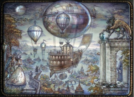 |
| Flying ship, mentioned in song |
 |
| Most of their songs mention forests/trees |
 |
| Their Logo reminded me of circuit board connections |
 |
| Simply a great image of very different view of a circuit board |
| I also thought that their logo could be packman characters |
and the Monsters and crazy looking animals!!!
 |
| Maurice Sendak,Where the wild things are. |


 |
| This is a RABBIT!! |
I did a few rough drawings (Which I will scan in at a later date because I've sent them off) and then launched into doing 5 different versions.Most of the versions I have done are portrait in composition purely because 90% of the gig posters I looked at were structured this way. I did one version landscape because I figured it couldn't be against the rules.....well hopefully not!
Version1: Northern lights
 |
| Final Northern lights |
 |
| Preparatory stage |
I did this using gouache on watercolour paper and cut out the O,M's and A in tissue paper. I used Indian ink and a brush pen to do the writing.
...pity I spelt Brighton without the H!! Ohh mannnn! It was too late to correct and a valuable lesson was learnt: if I am going to hand write the lettering..I need to have full active concentration! Alternatively I should have perhaps written it on another layer e.g.: on tracing paper or of course scanned both sections in and tried to adjust digitally therefore allowing for mistakes to be corrected.
Also I did the sky using gouache which has a Matt effect and I feel that perhaps using watercolours may have provided a more translucent effect for the sky.....it may not have but perhaps worth a try if time had allowed!
Version 2: Stars
 |
| Photograph of version 1 of the stars |
 |
| Scanned copy of version 2 stars |
 |
| Photograph of version 2 of the stars |
For this version I painted an A3 piece of drawing paper with black quink. Once this was dry I used a twice to apply bleach to the surface and draw on the design.
After completing the first version I felt the text was too small for a poster and therefore did a second (very similar) version with larger text. My Husband commented that he didn't mind the smaller text and felt that it appeared that it was emerging through the black which is also a nice thought. For me I still feel as a poster providing information, the larger text does this element better. What I did find though was this poster photographed better then it scanned which was interesting.
This version was the quickest to create which is probably part of the reason I really enjoyed creating it! I also enjoy allowing the material to play a role in how the finished image turns out as the bleach doesn't always react uniformly.
Version 3: Ship
 |
| Final Collage Ship version |
For this version I drew inspiration from the British collage and mixed media artist, Mark Herald:


I love the textures that he creates, his combination of printmaking processes and mixed media and his joyous use of nature as most of his primary subject matter.
This was by far my most time consuming version which entailed a lot of working into the poster and changing things around as I went along.
I played around with a variety of compositions especially whether to include the fish as I had planned initially in my rough sketch. I found that putting together the appropriate colours was very challenging in this piece, especially when it came to the text. In the end I created a predominantly diagonal composition to create a sense of movement as well as to draw the eye to some of the information. In so saying that the yellow text re: the venue is very much horizontal to contrast the predominantly diagonal composition.
I enjoyed working in mixed media i.e.: gouache, tissue paper, ink, white paper and cut outs and I enjoyed the textures that were created between the tissue paper and paint and using a tooth brush to apply the paint for the sea as well.
I am not sure that it works the best as a poster per say though and I think it is because perhaps the colours are competing a little bit more then they should which confuses the viewer a little bit regarding where the focus of the image is. I'm not sure really...perhaps I have looked it toooooo many times!
 |
| Pencil start and 1st layer of sea paint |
 |
| Sea with tissue paper and planning text |
 |
| To fish or not to fish? |
 |
| Trialling all cut out text on poster before sticking down with glue |
My original idea was to try and lino print the text onto the poster but because it taken SO long, I was running out of time and didn't want to make a mistake that would be irreparable...I decided to rather cut-out my hand-written lettering.
Version 4: Forest
This version was also one of the quickest to create for me....which always makes me partial to it! ; )
 |
| Final Forest version |
 |
| Preparation step revealing masking fluid |
 |
| Mobile phone photograph edited on phone using Picsart app: High Definition |
I make the mistake of using quite a thin drawing paper which was a little too thin for these wet media and so the buckling of the paper is evident even in the scan. This is better when edited in the pics art programme on my phone so it may have been worthwhile using an image editing programme like pixelmator to tray and achieve this type of effect on the scanned original.
On the whole I enjoyed creating it. I didn't really plan where each colour should be but rather did this as I went along. I think it is quite effective as a poster because the contrast of the bright colours against the black silhouette of the trees is eye catching. It has a stained glass window effect which was unintentional. I'm not sure if the silhouettes of the trees completely come across as well.
My final version: MONSTER version!
I decided to Lin cut this version and decided to go crazy and do it in a landscape composition.
 | ||||||
Final Black and white monster A3 lino print
|


No comments:
Post a Comment