The client specifically wants three illustrations featuring extinct animals interacting in some fun way with a biscuit to be used on the boxes. The drawings should be in full colour, and the client would like the colours to reflect the ‘flavour’ of the biscuit.
Go to the shops and research the market. How will you stand out amongst the others?


I
started by looking at packaging for children’s sweets and biscuits in my local
supermarket as well as in the ‘organic’ shop. From looking at the packaging
that is currently produced, most of it seems to be aimed at the child rather
then their parents so I decided to follow suit. Many also had a cut out/see
though area where one could see the food inside ie: sweets or biscuits and I
think this is effective therefore hoped to also do this.
Regarding
the drawings themselves, I did far less research/preparatory drawings then
usual…and less then I should have perhaps but of course looked up what dinosaurs looked like. I started with Tyrannosaurus and then basically looked for a dinosaur beginning with 'd' and then one beginning with 'f':
| Tyrannosaurus |
| Diplodocus |
 |
| Fukuisaurus |
I basically just launched in...mmmmmmm.......This wasn’t intentional by any means, but
basically I decided to do a preparatory drawing of a tyrannosaurus using sharpie
marker pens and basically quite liked the image and felt it suited the brief especially in the felt tips
because of the vibrant colours and the flat colour. So I decided to use the image and play around with ideas for making a final image from it. I then worked out two other characters in the same
style.
 |
| First/final image of Tyrannosaurus |
I did pencil preparations for the other 2 dinosaurs( ie: raisin and
choc-chip) so they looked stylistically similar to the tyrannosaurus image.
What
it did mean was that I stopped there at my 1st drawing. Of course I
had every intention to return and try at least one other version but time took
over and well, I ran out of it! So I stuck with the felt tip dinos.
I
did research the Diplodocus and the Fukuisaurus a little more. The choice of
these two dinosaurs was largely down to an alphabet search of dinosaurs so that
I could use alliteration in the heading of the biscuits. And therefore
diplodocus delight emerged and Fukuisaurus feast emerged.
 |
| Final Diplodocus |
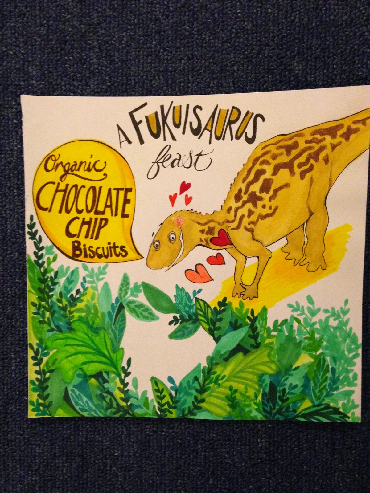 |
| final Fukuisaurus |
The idea for all images is that the gap between the leaves is cut out and covered with clear celophane so that the actual biscuits can show through the gap.
I
did a basic (half) box template just to demonstrate how the image could be
translated into a 3d object that a box is. I chose an irregular size for a box
so that these dino biscuits would stand out. I should have gone the whole toot
and done complete box template as I would include some kind of design aspect on
the back of the box as well.
How
well did it go?
I
think the Tyrannosaurus and Diplodocus work the better out of the three images. I also did
a bit of ‘market research’ with my work colleagues who have children and they
commented that although they liked all three dinosaurs, the Fukuisaurus was far
too close to sounding like a swear word which they confirmed kids would be the
1st to pick up on! How did I miss this?!? Needless to say I think
they are right and supermarkets would most likely agree so I will probably have
to redo choc chip anyway and change his name completely.
I
found myself trying to consider what we have learnt up until now in terms of
cropping the images and distorting them as well which I think adds humour to
the characters.
I
also enjoyed just launching in with the felt-tips and using this ‘prep’ drawing
as the final image. This was a tricky decision because I have a tendency to
overwork characters so this was quite refreshing. Using the felt tips as a
medium was also enjoyable although their ink doesn’t always last as long as I
hoped. I can see why a number of illustrators/graphic novelists use them for
their final images.