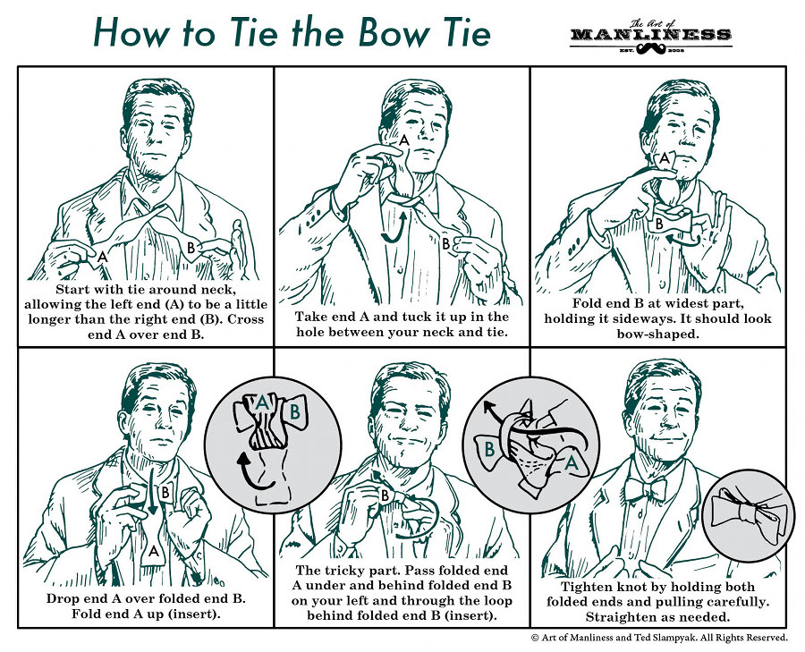
- Making a cup of tea
- Getting to my house
- Or Playing a tune on an instrument
I decided to give instructions on how to get to my house. I collected examples of general giving instructions and then collected some examples of maps that I liked.
 |
| Adi Galili |
 |
| Running for Crayons Christina Engel |
I chose to do a map-style set of instructions.
I started by taking photographs of the route from Brighton Station to my flat in Hove.
 | ||||
Brighton Station
|
 |
| Komedia |
 |
| Dirty Harry shop North Laines |
 | ||
Mash Tun Pub
|
 |
| Hove Beach Huts |
 |
| Brighton Dome |
 |
| Brighton Pavillion |
I did a few preparatory, rough drawings for my map. The more drawings I did the more I realised I would not be able to include allll my favourite buildings or be completely accurate to include very road along the route either. I decided to use artistic licence and use the buildings as more of a landmark reference/guide to the instructions related to how to get to my house.
 |
| map development 1 |
 | ||||
map development 2
|
I have made a number of notes in my learning log surrounding this exercise. I enjoyed it thoroughly but would have liked to try a number of different versions and ideas...perhaps a version which is separated into a sequence of drawings i.e.: more of a comic book/graphic novel approach to include different angels or perhaps rather trial a more step by step approach or perhaps just a different version of the map.
I am also not sure if using the coloured paper for this particular project completely worked.
The composition is still the factor that concerns me the most though. (see above) Perhaps it is a little too balanced with the two areas of green in the front of the image on a horizontal plane. It may have be worth having the Dome and pavilion slightly higher up on the page which would also mean being able to extend the diagonal of 'north street' which may have helped with " my middle-map issues" because, if anything, this would have pushed this area of centre which may have solved my initial issue straight away....well perhaps! ; )


No comments:
Post a Comment