
The focus of the next exercise was to read the passage provided, collect reference and create a portrait to depict the character that is described within the passage.
The passage read as follows:

I really enjoyed starting this exercise. I have decided to post what I have done so far but must stress that this image is far from complete.
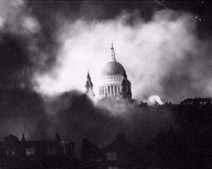
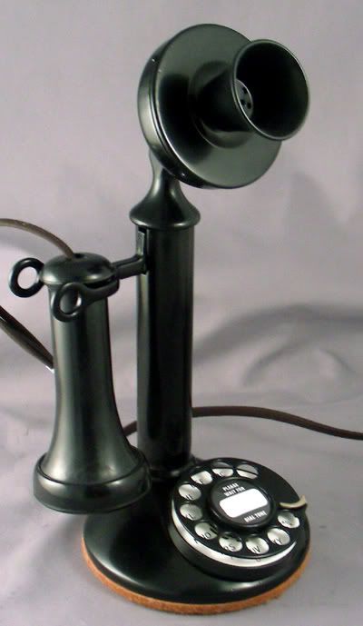
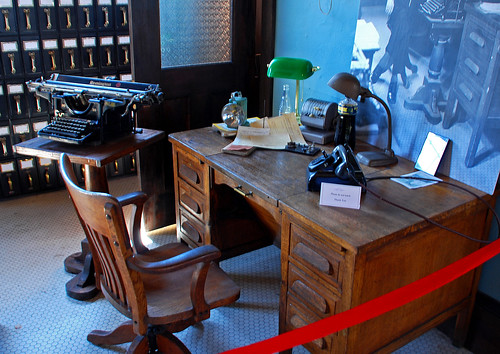
I started off by heading to the library and looking at some 1940s reference film magazines/periodicals, and using the internet to find images from then blitz in London in 1940 ,1941, objects like telephones of the era and furniture like desks and chairs.
Film periodical:

Images of the Blitz and war time London:


2. Images of 1940s phones:

2. Images of 1940s furniture:
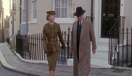
3. 1940s images of policeman and detectives


I needed to read up on the blitz to get a greater understanding of what it would feel like and look like living during this time. The BBC site below offered this information succinctly.
I also read up about policemen in the war and found a fascinating article on the internet (see below) which gave ma a little more insight into the type of emotions that I wanted my character to exude.
Police during the Second
World War
On the eve of the war there were some
60,000 police officers in England and Wales divided between 182 separate police
forces. The largest force was the Metropolitan Police in London with just
under 20,000 men; there was a separate force for the City of London (1,100
men). There were 58 county forces and 122 forces patrolling cities and
boroughs.
There were fewer than 300 women in the
total of 60,000. Policing was seen as a man’s job. Women police
officers were largely confined to dealing with family problems and particularly
with women and children.
The war required young men to fight
it. It also required reservists – men who had recently been soldiers – to
return to the army or navy since trained men were essential. Many police
officers were reservists, and many more were young enough to serve in the armed
forces. This meant that, at the outset of the war, police numbers were
reduced as reservists returned to their units and as young police officers
volunteered for military service. The government and the police
authorities sought to limit the reduction in police officers by restricting the
numbers who might volunteer (see A Volunteer). The ranks were made up by recruiting reserve policemen, special
constables and more women officers. In 1944 there were 43,000 regular
police officers, 17,000 War Reserve Police and Special Constables, and 385
women police.
The police grew older as the war
progressed. While young men went into the armed forces, older men stayed
on past their retirement date or enlisted as reserve constables or
specials. Police duties increased because of the war. In addition
to their usual tasks of keeping the peace, pursuing criminals, making sure that
the traffic flowed freely, they had new duties – enforcing the wartime
blackout, assisting the rescue services during and after bombing raids,
checking on enemy aliens in the country, pursuing army deserters. The new
burdens probably contributed to the growing sickness rate among the
police. In 1939 181,300 days were lost to the Metropolitan Police because
of sickness; in 1945 this had risen to 345,600 days.
The article highlights the stress that a policeman were under during the war. Their job role seemed far more blurred then it may have been pre- and post -war. They also played a more in-direct role in the war effort and this may have affected their sense of value in terms of 'serving their country' and saving lives. All aspects of life outside of the war seemed to lie in a shadow of the war and dealing with more 'mundane' crimes pale in comparison to the war effort.
The passage we were given describes a policeman involved in investigating missing girls which like many other mysteries still needed to be investigated but must have always seemed less important in comparison with the war effort or perhaps it was the bureaucracy that stood in the way of making a difference and solving these crimes because all aspects of life and government were dominated by the war. It may have been that the war itself also got in the way of trying to solve these crimes in terms of practically being unable to go outside at times or managing curfews etcetera which were in place in the UK during the war.
In our passage the man described is middle aged which corresponds to the information provided which explained that younger officers were sent to the armed forces while the older officers stayed behind picking up the pieces.
When reading the passage, especially the last sentence sentence:
" Here lay his anger as he looked out over London...year by year the anger burst deeper until it was now the innermost principle of the man."
You can't help feeling that this man has been fighting for justice for so many years and the war has just beaten him. It seems all too big and meaningless. The word that I decided to chose to be central to the image was FUTILE. The feeling that actually it didn't matter how hard this man worked, how hard he fought, it achieved nothing and the war made it that much more meaningless.
I've started a couple of mood boards/mind maps:


One particular character that I photocopied from the film periodical stood out for me particularly. I had it in my mind that I wanted my character to be smoking as men always look more stressed when they smoke...in my opinion! That was one thing that drew me to this photograph. I also wanted to have my character wearing a fedora hat which seems to represent men of the 1940s.

The character itself wasn't exactly what I wanted in that he is looking up and he looks angry but does not give across a feeling of hopelessness and futility. I decided to base the 1st draft of my character on him anyway and make the necessary changes I needed:
 |
| Pencil drawing version 1 |
I then photocopied the drawing in order to be able to play around with the content and composition and consider other elements needed.
 |
| photocopy of pencil drawing |
I actually liked the textures that the photocopy brought into the image. I wanted to try include windows that the character would be looking out onto london. These are some of my experiments:

I wanted to have the windows raised to create natural shadow.This works in a photograph but I asked myself whether it would work as an image without being photographed

I found that the widows were too small in this image so made them bigger in the next one:

| close up of cut out shapes placed on white A3 photocopy
I decided to try the image as a dry point etching in my 6 week evening-printmaking course. I did a sepia version and then a black and white version which included chin cole:
|
 | ||
Sepia Dry-point etching
|

I really liked the effect of the etching process. The downfall is of course that I don't have a press at home so had to settle for just the 2 images. The thought process behind the chin cole initially was to have wanted posters but I wasn't sure how to make this so that they looked printed and ran out of time to work it out so used a dress making pattern just because I had one in my bag and it was thin enough to go through the press! (nothing deeper then that I'm afraid! ; )
So basically where I have left it is that I have photocopied the sepia etching and will continue to press on with this exercise.

It was a struggle trying to work 'backwards as I was keen to use the etching above but needed to fit it to the brief...perhaps not the right way around but I pressed on out of sheer obstinance!
After much thought and research I decided to symbolise WWII by including a shadow of Barrage balloon and I decided to symbolise that my character was a policeman by including a map of london with 'photographs' of missing girls on it.
I used an internet search to research the barrage balloons and photocopied photographs reducing them to size, from a world war II book which focused on Anne Frank.
I then photographed the image with my phone and used a programme called Picsart to ammend the light slightly.
The difficulty I had with reworking my image was that I was working on top of a photocopy of the original etching which mean that the paper itself did not lend itself to having ink or paint on it....which unfortunately I found out the hard way. These are 4 of my final experiments:


 |
| Final Image: Choosing content
I decided on this image in the end as I felt it had the most drama due to the change in light. I also decided to crop the character and make the map smaller to push the character further into the foreground.
Learning points: 1. Working the process backwards is no easy feat and I am not 100% happy with the result. The shadow for me is too strong but due to the limitations of the flimsy paper I struggled to change this. 2. The image I chose in the end was composed as a landscape image and story books for adults are generally portrait/vertical in format, so again I had to fit the image into this format which it didn't naturally fit in to. 3. The paper was not suited to inks/paints particularly well as I had used the photocopied the image which was on ordinary paper and the paper had a tendency to buckle. Even dry materials like charcoal didn't work as well as I'd hoped. The surface that the material is on really makes a difference! (To the image and to one's sanity!) I decided to present the image in a format of a book as this was the purpose of the portrait. This is the outside of the "book":  
Final portait within the book with passage retyped and printed on brown paper that I got from a 1940s scrapbook that I picked up at a second hand sale.
Although I was not 100% happy with the final image, it was a relief getting it done!
|


