
I am currently studying Illustration through OCA and this is my Learning Log for the course
Tuesday, 15 September 2015
unfinished verrrrrrry short stop motion
Friday, 17 July 2015
Some amended images post tutor feedback
Life has been a bit of a roller coaster ride recently with the need to rush back to South Africa just before having to hand in my work for assessment. Anyway, I managed to amend a few images before leaving so I have decided to post a few of the amended images now.
1.) Exercise 2.9 : Black and white
 | ||
Original Black and white version. My tutor made the accurate comment that the sea looked less observed and therefore took away from the image.
|

2.) Assignment 2: Autumn poster
 |
| Original Autumn point of sale poster |
 |
| Amended Autumn point of sale poster |
3.) Exercise 3.5: Giving instructions
 |
| Original "Map to my house" |
 |
| Amended map to my house |
There are a few more touch ups to do but I'm happy with the progress that making some changes have made thus far.
4.) Assignment 3: Making a poster
For this assignment I chose to do a few versions of a poster for the band "Of Monsters and Men."
There were elements of each poster that I get worked but there were mostly elements that simply felt wrong! I was unable to put my finger on what was wrong with any of them but my tutor suggested that by limiting the colour pallet in the lino version; rethinking the version I called "northern lights"; fine-tuning the 'forest version and adding one simple colour/detail to the "stars"version. I haven' had a chance to alter the "stars" version yet but having made the changes suggested to the other posters I can see they are already more successful.
a.) Lino version:
Three re-worked images:


4.) Assignment 3: Making a poster
For this assignment I chose to do a few versions of a poster for the band "Of Monsters and Men."
There were elements of each poster that I get worked but there were mostly elements that simply felt wrong! I was unable to put my finger on what was wrong with any of them but my tutor suggested that by limiting the colour pallet in the lino version; rethinking the version I called "northern lights"; fine-tuning the 'forest version and adding one simple colour/detail to the "stars"version. I haven' had a chance to alter the "stars" version yet but having made the changes suggested to the other posters I can see they are already more successful.
a.) Lino version:
 |
| Original Version: too many colours distracting the viewer and distracting from any focal point.Just too busy with too many colours. |


I like the blue and green versions the most. The blue version hints at the gig being at night but I think the colours in he green version seem to stand out a little more. Either way I think all three are more successful then the original version simply by using a limited colour pallet especially in such a busy image. Great advice Christian. : )
b.) "Northern Lights" version:
 |
| Original version that didn't quite work done in gouache, especially the sky. |
 |
| Woodcut version: more stylised and so very different but I think the simple mark making as well as limited pallet makes the information particularly stand out and in a poster this is important. Again I think it is more successful then the original image. |
c.) The Forest version
 | ||
Original version: main issue was that the black ink I used was too wet for the thin paper and therefore the paper tended to buckle. It also appears a little flat.
|

Thursday, 12 March 2015
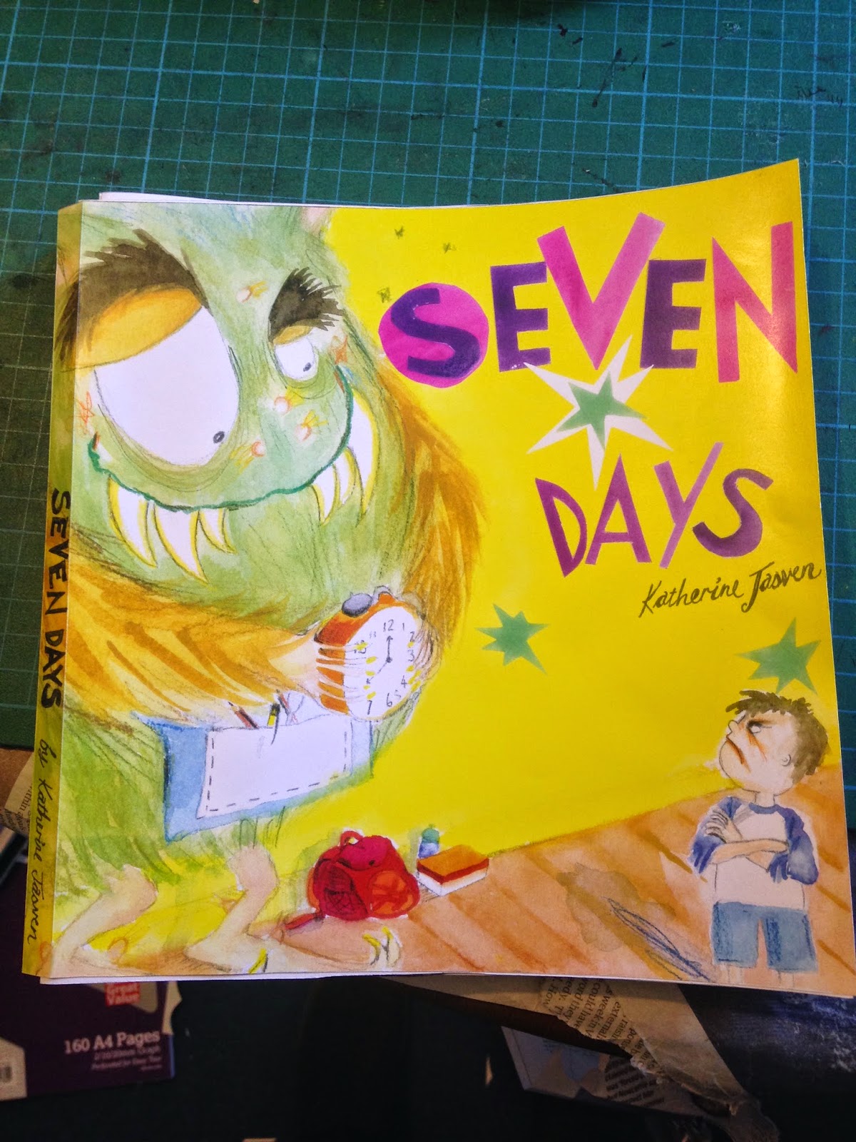
ASSIGNEMENT 5: SEVEN DAYS
Brief: The title is Seven days.
These can be the seven days of the week or random days that tell a story. Your interpretation can be objective or subjective. You can produce seven separate, one large diagrammatic or a continuous strip illustration. You can decide on the media and methods you will use; the context – magazine, newspaper, book, brochure or poster; and the intended audience.
These can be the seven days of the week or random days that tell a story. Your interpretation can be objective or subjective. You can produce seven separate, one large diagrammatic or a continuous strip illustration. You can decide on the media and methods you will use; the context – magazine, newspaper, book, brochure or poster; and the intended audience.
You need to write yourself a brief that is clear and challenging but manageable.
Yes, again I found myself becoming a littttle overwhelmed by the fact that this was our final assignment and should demonstrate all the skills that we have acquired and learnt within the course! It probably also didn't help that I failed to follow the final instruction on the brief i.e.: "Write yourself a brief that is clear and manageable"...... mmmmmmmm! I so need to remember to read the brief completely! Oy!
First of all I brainstormed what felt like a THOUSAND ideas to get started and got stuck into researching everything and anything to do with seven days that I could think of.


Initial character Studies


Colour studies:

Final Storyboard:


Yes, again I found myself becoming a littttle overwhelmed by the fact that this was our final assignment and should demonstrate all the skills that we have acquired and learnt within the course! It probably also didn't help that I failed to follow the final instruction on the brief i.e.: "Write yourself a brief that is clear and manageable"...... mmmmmmmm! I so need to remember to read the brief completely! Oy!
First of all I brainstormed what felt like a THOUSAND ideas to get started and got stuck into researching everything and anything to do with seven days that I could think of.
My
research started around looking into the origins of the names of the days of
the week in English and French with their derivatives in Germanic and Latin
heritage respectively. I then toyed with illustrating the story of
creation as it follows a seven day sequence. My ideal would have been to do a
stop-motion animation, William Kentridge style….but abandoned this due to time
and current oil-and-water-relationship with computer technology. I considered
doing a graphic novelette around seven days in A and E as it is topical and I
work in A and E…but abandoned this. I considered doing a hostage story e.g.: either seven days or events that lead up to the situation...but abandoned this as well.
The common theme I seemed to return to was the history of the names of the days of the week mostly because they are linked to
the names of our planets, which adds a visual element. I considered doing an
educational type book with the seven days and their origins but felt this would
be more effective as seven posted screen printed or something…Katherina
Manolasou stylesque, which I don’t know how to do. I also grappled wit the fact
that the book would only be 7 pages or perhaps 14 if you made each one a double
page spread …so abandoned this idea…went crazy too’ing and froing and then
decided to drink some coffee.
In the coffee shop….with all background research
fresh in my head I decided to just doodle while sipping my flat white. My doodles
became the foundation for potential characters that would represent each day.
 |
| Initial coffee-shop doodle |
The idea still stemmed from alien type creatures for various planets that have
subsequently become the names of our days of the week. With this idea I was
able to develop it into a narrative and then created a rough storyboard. This
was a 1st at doing anything like this so things shifted and changed
a lot along the way but once I had the framework of the narrative and the basic
outline of the idea for the characters, I could start developing the characters
and the story board.
Rough Storyboard
Initial character Studies
Colour studies:
 |
| Initially Monay was blue..implying 'blue monday" but I ended up with a more natural green to imply that he stunk! |
Final Storyboard:
Everything evolved relatively organically…..which was good
because I had a week to doo it before submission! The sudden realization of
doing artwork for all the pages was daunting so I decided that for this 1st
version I’ll stick to more traditional media ie: watercolour. I also justified
my choice as many of my favourite books still being produced are watercolours. e.g.:
David Roberts and Quentin Blake, who demonstrate very different ways of using
this medium and are both wonderful. As I went along though, I realized that I
did not share their skill with watercolours on any capacity and the images were
missing something! SO I decided to mix some of the images up with Gouache and
collage and I think that this made a big difference. Unfortunately having so
many colours at my disposal and so little time meant that working out a limited
colour pallet was out of the question as I just needed to get brush to paper! I
did try to use all the things that we have learnt on the course when creating
the story board ie: cropping; using scale; using diagonals; using mark-making;
using distortion; looking at composition and viewpoint. I also feel strongly
that drawing from life in my sketchbooks has given me a greater confidence and
knowledge of how the human body moves and therefore more able to adapt this to
fictional characters. I have certainly gained confidence in my sketchbooks and
feel freer also to doodle, which I feel, has really helped inform my more
finished work.

 |
| Layering the originals |
 |
| Watercolour carnage....in my lounge!! |
This is a scanned version of my colour photocopy version:
 |
| I think Monday is maybe a little too roundy in shape...? |
 |
| Not sure if the yellow speech bubbles are just a little too over-powering.... |
 |
| I'm not sure if the typeface for 'Friday" quite works. |
 |
| Oh no, I left out one speech bubble that the little boy says: "Monday you stink!" as well as the sentence: on the page next door: " Perhaps everyone was better off without him."...written in the bottom left corner of the page i.e.: as Monday exits. |
 |
| The hand written white writing ? tends to disappear into the background a little too much |
 |
| uh oh...where's wednesday? |
 |
| O no! Where is Tuesday's tie??!? |
 |
| On the 1st page on retrospect, the sentence should have read: "...and although his job to start the week..." so that the second page can read "...even though" and not sound too repetative. |
On
the whole I loved the process despite the very little sleep had in order to
finish. I am also happy with the little book that I have produced. My second
last page I feel has tooooo much text and I probably need to look at either
editing the text or possibly adding in a page. I realised I left out a speech bubble and a one line of text on submission which was a shame....happens when you rushing I guess.....note to self!
It was a struggle to make sure that I had consistency within the characters and I know that I forgot the tie on Tuesday in one of the images.
It was a struggle to make sure that I had consistency within the characters and I know that I forgot the tie on Tuesday in one of the images.
I
also chose to handwrite the text as I know that there were a few pages that I
wanted the illustrated only by text. (It also filled me with trepidation
thinking about scanning and editing 35pages to add text on my computer!!!!) I think that perhaps a mix of typed text with handwritten text may work better....perhaps that worth is a try later.
I also wanted to do the original artwork just short of A2 but before doing the artwork I contacted a local printing shop to find out the cost of scanning A2 and the cost was just too far out of my budget for the amount of pages I was hoping to scan and print in order to present the storyboard as a little mock-up book. As a result I reduced the artwork to fit into A3 so that I could photocopy it at the local library and scan it in at the library as well. Not quite the same quality I'm sure which is a bit of a shame.
I would (in an ideal world) like to consider doing another version
using different media e.g.: litho or screen-printing (when I have yet to learn to do!
lol!) or perhaps even relief printing to see how that would change the
images but on the whole I have received positive feedback (from
very biased friends and family ; ) I wasn't entirely sure if the story targeted adults or children although the images were designed with children in mind. I did however really enjoy making it and I hope that you enjoy reading it.
Subscribe to:
Posts (Atom)