Learning Points from assignment 1:
Exercise 2.1: Writing a brief:
Project: Write a brief for a chosen image that would have lead to the creation of the image and comment.
I recently decided to try out one of the
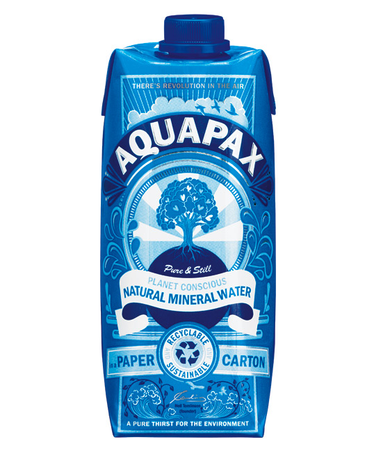
local Bikram Yoga studios in Brighton and was given a revolutionary water "bottle" ie: portable water packaged in a carton…. a first for me and I am sure is the only reason I survived the heat of the yoga session! ; )
I was immediately transfixed by the packaging
of the Aquapax water carton and decided to analyse it artwork for this
exercise.
On my initial assessment of this water
carton I made the assumption it was either a brand new product which I’d seen
for the 1st time, as I had personally not seen water sold in a carton, or this was a re-brand of a product which I only noticed because of the new art
work.
Sure enough it turned out to be the latter
on further research.
After a bit of research about the director of the Aquapax company, Neil Tomlinson, it became evident that he is passionate about the environment and this is what drives his new company. He states that his aim is to have a company that
is " a sustainable business with a minimal carbon footprint while packaging, marketing and selling portable clean, truly pure drinking water, packed in more environmentally sustainable and fundamentally renewable paper cartons, with practical pack attributes that facilitate a long and efficient storage-life."
Following this internet research, I tried to put myself in Mr Tomlinson's psyche and therefore worded the brief from "him" to the artist/design agency along the lines of something like this:
“ Dear Artists at SunHouse Creative Ltd, we need to rebrand our product. Please will you create a design that
echoes the ethos of our water company and the ideology and reasoning behind
placing our water in a carton instead of a plastic bottle. We are true
environmentalists and this is the heart behind our product. We are trying to
encourage people to drink portable water in a different way thereby keeping them aware
of the environment and thus the source of the water they are drinking. We want to highlight that we are the 1st company in the UK to be packaging water in a carton and hope not to be the last due to the environmental benefits. We want people to be attracted to the freshness of the water carton and immediately identify with this new way of thinking about water, sustainability and about being involved consumers.”
Comments:
I feel that the artists at Sunhouse have achieved this very successfully with their new packaging both with the phrases they have chosen. i.e: “Pure thirst for the environment", "There's revolution in the air", " Planet conscious mineral water" and finally " sustainable, recyclable" and their decorative graphics.
Images and symbols
The artists at SunHouse have used symbolic imagery to reference the phrases above.
Firstly, they have chosen to use a tree to symbolise the environment and nature as it is a well known symbol of life, knowledge and the natural world. By placing hearts in the leaves of the tree it becomes a symbol of love for the natural as well. It is placed at the centre of the image making it the focal point therefore also symbolising that this naturalistic love for the environment is at the heart of Aquapax, the company .
They cleverly illustrate graphically that Aquapax has started a “REVOLUTION” by using symbolic rays surrounding the tree,
which extend into the sky. The rays of 'hope’ and 'a bright future' have been
used historically on numerous political posters symbolising revolution and are therefore immediately recognisable.
Graphically this is a strong symbol representing an end to the old ‘oppressive regime of plastic bottled water’ while also symbolising the challenge people to think as individuals instead of sheep-like consumers, and that as such we have the power to change and do good starting by purchasing this product. It evokes an emotional response that this product is not simply about drinking water, but is a small
step in being conscious environmentalists, concerned about what we consume as well as the environmental and global impact we make as consumers.
The designs within this packaging also have an eastern, meditative,
‘one-with-nature’ feel.
The shape of the water drops appears in a
number of Indian-Hindu designs. The SunHouse artists have used this and repeated the water drop shape creating a decorative pattern on either side of the tree which appears to
reference indian philosophy of nature, peace and harmony while of course also representing water itself.
The line drawings underneath the text also appear to symbolize the water cycle and its link to nature and the cycle of life.
Neil Tomlinson's signature blends well in the middle of the symbolic water cycles on either side, putting him at the heart of Aquapax and indicating the ethos that he stands by, i.e: that he is an environmentalist who is contributing to maintaining the natural water cycle.
Style, colour, composition, typography:
·
Style: The graphics are patterned and decorative with a
strong emphasis on line, shape and flat colour. Tonal differences are
created through contrasting colours placed next to each other, for
example the dark blue lines and lighter turquoise blue within the trunk of the tree or the white banner over the navy world as well as the white contrasted with the blue in the rays.
·
Colour: The shades of blue are
used effectively. Not only does it symbolize water but also it makes the design
look fresh and ‘thirst-quenching’. The
small lines of metallic glossy silver add to the artwork both symbolically as
if this water carton is the silver lining in the air of this revolutionary
thinking and as a representation of when light hits natural water and it
shimmers.
·
Composition: The composition
appears balanced and symmetrical, symbolizing calm and order when nature is
central and things are working as they should. One’s eye is drawn
immediately to the central figure of the ‘tree of love’ and then the rays
direct the viewer outward to the birds and the symbols of water.
The type also
assists in balancing the composition by having an equal number of words or letters
on either side of the midline and generally one word or symbol in the middle. E.g.: AQU (on
the left)-A (middle) and PAX (on the right.)
·
Typography: The primary font
used is a strong easy to read font and most of the words are written in the same font with different shades or size. It appears almost like someone’s natural
handwritten writing when writing capitol letters or block letters.This is contrasted
only with a smaller, gentler cursive-type font for the phrase "pure and still". The viewer’s eye is immediately drawn towards the phrase as a result of the change in font in spite of it’s size. This is helped by the fact that it is
directly in the middle and is written in white to contrast the navy background but it is also the fact that the cursive font is flowing and connected and emulates cursive handwriting.
The shades of blue as well as the use of white type provides emphasis on which phrases are most important. This is demonstrated by the title of the brand.
In summary I feel that the artists at SunHouse
Creative ltd have made ALL the difference to this product. When it was
initially put on the market it looked like a corporate sports drink and I
certainly would never have noticed it….or should I say never did notice it!
The artwork has brought the product alive, answered the given brief and challenges us as consumers to think
about what we drink and how we drink it!
In my learning log book I reflected a little more on the question:
Reflection
1: brief
What
did I do?
When
I re-read my 1st attempt at the brief I had published on my blog I
realized I had failed to include some vital details like deadline/timeframe,
target audience, slogans/logos etc.
The
brief that I wrote allows the artist a fair amount of artistic freedom and I
question whether in reality companies/ commissioners for advertising and
editorial illustrations are more prescriptive in terms of the exact details
that they wish to se in the artwork including the graphic elements like the
colour that they wish to be used and the colour pallet; the medium that they
wish the artist to consider; perhaps the symbols used; the composition; content
and the font/typeface used.
I
also wasn’t entirely sure whether the company would provide the logo/slogan or
whether the artists would be responsible for creating this. In this case the
logo ‘Join the Revolution” is central to the image.
How
do I feel about this exercise?
When
re-reading the rest of the blog post, which was commenting on the brief, I went
on to analyse the image that had been created. In retrospect, I know longer
feel that that this was required to answer the exercise and think that I went
on a bit of a tangent analyzing the completed image itself rather then
commenting on the process of writing the brief and whether I had done this
correctly. Having re-read the exercise
and the question, I feel I should have spent more time understanding what was
required. I got carried away with a lovely image. I also feel that the 1st
attempt I had at writing the brief itself was a bit ‘airy-fairy’ and would not
answer the artist’s questions about what the client actually wanted for the
design and therefore perhaps making it more difficult to work with that type of
brief.
What
would I do differently?
I
would change the brief to include some of the elements discussed above. I have
therefore re-written the brief to be a little more directive which may or may
not happen in reality.
“ Dear Artists at SunHouse Creative Ltd, we need to
rebrand our product.
We are looking for an eye catching design which
will not only catch peoples attention straight away but also echoes the ethos
of our water company and the ideology and reasoning behind placing our water in
a carton instead of a plastic bottle.
· About our company:
We are true environmentalists and this is the heart
behind our product. We are trying to encourage people to drink portable water
in a different way thereby keeping them aware of the environment and thus the
source of the water they are drinking.
· What we want the design to do:
· 1. Emphasise the emphasise that are the 1st company in the UK to be
packaging water in a carton and hope not to be the last due to the
environmental benefits.
The
central slogan around which the design should be based is therefore: “ There is
revolution in the air”.
2. We want people to be attracted to the freshness
of the water carton and immediately identify with this new way of thinking
about portable water.
· Target audience:
We
want the design to attract a target audience of people that are conscious about
the environment and will go the extra mile to purchase products that promote
the environment.
· Design itself:
1.
The
colours of the company are silver and blue. We would like the colour of the new
brand to be predominantly blue and use a restricted palette of blue white and
silver to enable people to understand that we are selling water. Having done
some market research on our original brand, we found that people did not
associate water with a predominantly silver container.
2.
We
would like the design to include graphic symbols that symbolize nature,
vitality, revolution, and love for the environment, the source of our water.
3.
We
want the font to be bold, clear and easy to read.
· Timeframe
1. We are launching our new
brand in 3 months. We will need to have 2 designs in 6 weeks in order to start fine-tuning
what works and what doesn’t.
What
did I learn?
1. I
learnt that I need to ensure that I am answering the question that is asked or
in the case of an image, answer the brief that is being asked.
2. The
process of writing the brief made me consider what the commissioner would need
to think about when they are providing a brief especially if they are
advertising their company. In other briefs like for the medium may also be
stipulated if this relates to what is being printed or even presented, for
example only use of digital images or use watercolors for a more organic hand
painted result etc.
3. Most
of all I learnt that there is a lot that lies beneath the surface when writing
a brief and therefore when interpreting a brief. I still am unclear how much artistic
freedom the illustrator is allowed and am aware that this will probably differ
from company to company or publisher to publisher.