Monday, 9 March 2015

Exe 5.2: Editorial Illustration

Brief: After researching images in various newspaper articles, were were asked to create an image for articles on one of the following subjects: 


-How green is your food?                             -Finding your family history 
-The best restaurant in town.                        -The object of my desire 
-Loves me, loves me not                               -An interview with Melvin Bragg 
-Throwing your money away                        -Paris, still the best place on earth 

I decided to do an image for 'An interview with Melvin Bragg". 

I started by looking up interview articles online as well as images of Melvin Bragg. I decided on an article with the headline: Melvin Bragg, the nation's schoolmaster" which was an article from the Guardian online written in 2014 and the image I chose to start with was from another interview:
 

After reading the article I highlighted the points that stood out to me within the article and those were:
a.) His idea that self-improvement, education! education! education! and art and culture...are key to a happy and fulfilled life.
b.) He has is an accomplished author having written a number of novels as well as more then a dozen non-fiction books.
c.) He has been heavily, and continues to be very involved in the BBC. 
d.) He is very involved in politics especially as an ambassador for art and culture.

I started by doing a pencil drawing of the magazine/internet picture. In my mind I had hoped to try and create one pencil/mixed media version and then a second relief print but due to time constraints had to stick to the pencil/mixed media version.
Ahhhh mouth is NOT right!

  
1st experiment with collaging magazine textures for jacket.


Final Image 
I think the image works although I am not sure if the pencil disappears a little bit too much with the yellow background.

Unfortunately I struggled intently with adding the text to the image but will continue to try to do this to finalise the image.


Exe 5.1: Your own work

Brief: For this Exercise we were asked to review all the work we've produced thus far and choose one image to create a product/artefact using this image.

This exercise filled me with excitement because it prompted me to think about the work I have produced beyond simply using it as course work.

On reflection I would however have liked to have spent more time researching different suppliers and looking a little further into the images I have produced in order to create a bit of a gallery of images to choose from.

This aside, I decided quite promptly on using the collage dog that I created for exe in section 4 i.e.: image distortion. I was deciding between using the black and white version of the coloured collage.
 

As I live in Kemp Town in Brighton which is FULLL of wonderful dogs of all shapes, sizes and styles, I decided to make the product specific to Kemp Town.  
I had HUGE ideas of creating little espresso cups with the image all around it ....or an apron...or cushion cover...or a wallet....OR....ahhhhhh price! I quickly realised that price definitely puts limitations on what could be produced! Also because I only wanted a one or a few items the price was generally higher and the cost of postage definitely surprised me especially when most of the websites seemed to actually be produced in the USA. What I also found was that producing 3-D objects like cups/mugs meant that on the cheaper/more available websites, the image looked a little like it had been stuck on like a home-made photo-mug and finally some companies/websites are much easier to use then others which certainly influenced what I could actually produce. 

In the end I opted for creating coasters as they were 2 dimensional and within my budget. I looked at a few suppliers and opted for the company photo box in the end and decided on using the collage dog in the end. 

Chosen one for coaster
 I made up the term Kemptonian...which I hope that people would understand! I then trialled backgrounds turquoise and a lavender-grey and finally decided on the lavender-grey.

Next step was deciding on a product…that was very much linked to the price I was willing to spend. Again unfortunately I also didn’t want to order too many of my chosen product at this stage because I wanted to see if it would work 1st therefore had to go with companies that charge more per unit but you can buy less and therefore spend less to start off with. 

Using these companies was a challenge at times because their systems aren’t really designed to work with images outside of photographs and therefor this limited what could be done when using pixelmator files to include text as well. Zazzle.co.uk was the easiest to use and I was happiest with the product but you only find out when you are ‘checking out’ that they are simply a co.uk name based in the USA so suddenly there’s a hefty postage charge and a 2 week wait.  

I decided to make a coaster because it was still 2d and reasonably priced. Amazon looks the cheapest on paper but only deals with photographs so needless to say I reached a compromise with Photobox.  

Photobox: £14.99 for 4
CafĂ© press: £8 for each coaster + £8 postage
Zazzle.co.uk: All items posted from the USA. £8.75/coaster Plus £15 for postage!
Amazon: £2.95/coaster but only able to use photographs not JPEG. 
I looked at Society 6 as they are geared to artists work but I am not a member so that proved difficult and they are also based in the USA. 


Final Coasters
The product is quite fun but of course there are limitations for example, the same image would be printed on each of the 4 coasters. I was quite happy with the quality of the printing and the product itself but think if this was a product to be sold you it would look better with one or more other characters.  From an image perspective I think perhaps a small shadow or horizon line to stop the dog from looking like he is floating. Also having spoken to a friend of mine she preferred the text on the turquoise version and the fact that the dog-character was standing on the word as the font appeared more genteel and she felt the character was like a little gentleman-dog, but agreed with the lavender background. I think she might be on to something....

On the whole I found this a very interesting exercise! Firstly it made me realise that I can and actually should start thinking about considering taking some images to the next level and as I build up a portfolio, thanks to this course, I have some work to fall back on or some ideas to fall back on. Also it pressed home how important researching suppliers is and of course if I was looking to sell I would need to ensure that not only did I cover my costs but that I made a prophet and there’s only so much one is prepared to pay for items like coasters etc. Needless to say this was a great 1st introduction and quite exciting to see my image on a little coaster even if it wasn’t 100% right.


Tuesday, 16 December 2014

Assignment 4: Magazine illustration

Brief: 

A magazine wants an illustration on one of the following topics:
Lost Disaster Discovery Guilty secret

They want an illustration based on a still life. You have the freedom to select the items for the still life and are given creative free rein. The rest of the content, the method you use to produce it and the colours you use are all for you to decide. 

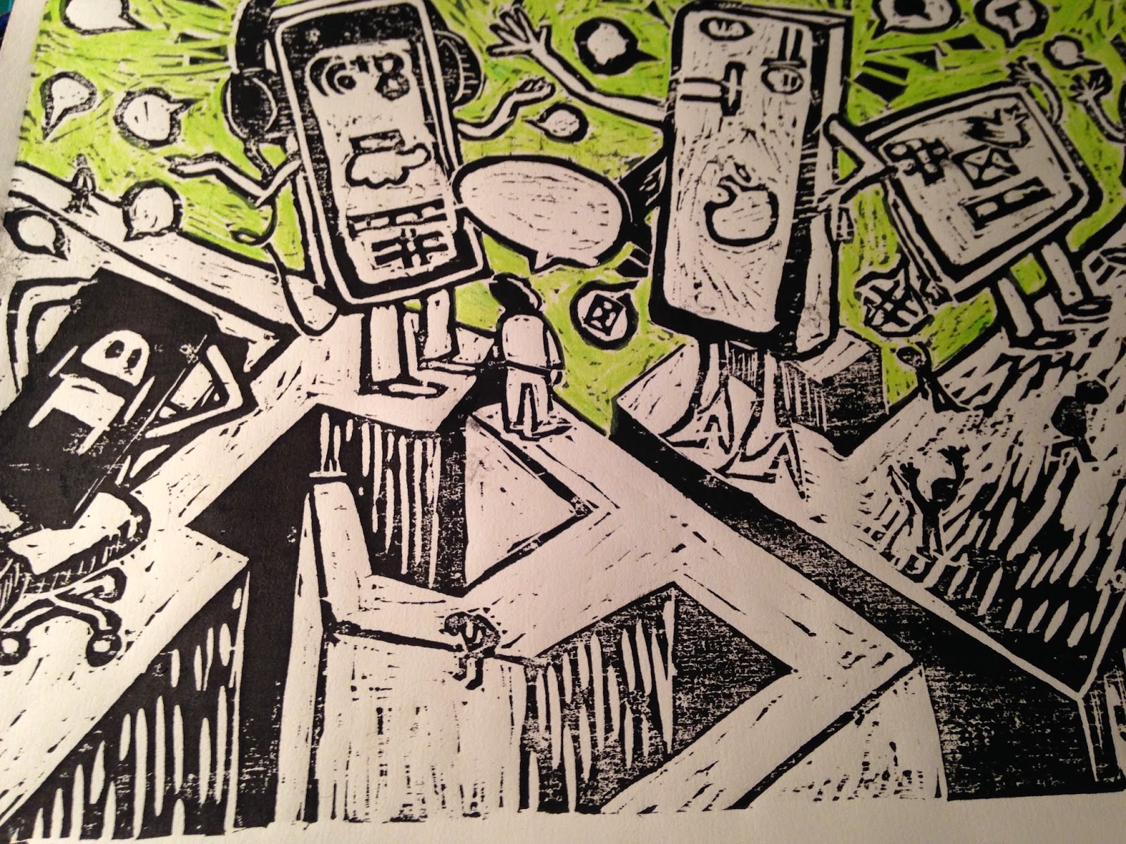
After a bit of a brainstorming, moodboard session, I decided to work with the topic "Lost". I think because I was feeling a little overwhelmed by my inadequacies with technology, I decided to search for articles that centred around being lost in the digital world or lost in technology. 

When I googled this I came across three articles of interest: one in the Guardian online and one in the New York Times online. In the end I decided to combine one of the articles in the Guardian with the article in the New York times as they dealt with very similar issues but I preferred the way the NYT article presented the content but I preferred the title of the Guardian's article. Thus came the (combo) article:
The Lost art of Communication. This article resonated with me not only because I feel a little like oil and water when it comes to relating to the virtual/technological world on ALL levels, but also because since I have been doing the course and therefore challenged to keep a sketch book and I am amazed at how often I am drawing people on some sought of tablet or mobile's touch screen, posture stooped, thumbs doing the talking, so when I saw the article I knew this was the article I wanted to use. 

I did however get a little enthusiastic about the idea that I left out the step of doing the still life and launched into using the objects that I thought were guilty of the above. I decided to follow the woodcut theme that I seemed to be using for this section of work and do a woodcut version and a collage version....unfortunately I ran out of time and therefore could only do the woodcut version! 


Roughs and rough colour study.

Half-carved wood

Photo of prints

Unused monoprint

Unused print: white on black
I found this print too busy and difficult to 'read'.

Unused print on white paper with neon-green painted background 
I didn't finish this print because the neon paint was simply spreading and dirtying the black ink and for all the effort it seemed less effective then the prints on tissue paper. 

I decided to introduce white into the image but vacillated between the amount of white to include and where it should be included:

Print on green tissue paper
print on pink tissue paper experimenting with white gouache and collage
Green tissue with alternative white gouache on maze 
experiment with pink tissue paper collage on green tissue print
I chose to add the text which poses the question : "Dinner anyone?" I chose to add this because this question challenges us to return to communicating around the dinner table- a place often considered the foundation of family and friendship and authentic conversation across cultures internationally.
                                                      

When I was ready to work on the layout and had a look at what type of magazine my image might potentially feature in....and suddenly I realised that having not completely considered the layout prior to doing the image. Especially as after having a good look at a number of magazines, the images were predominantly portrait in layout as opposed to mine which was landscape.

I was quite frustrated with myself for not considering this earlier especially as I have had this issue with other images. Hopefully this time I will learn from it.

To finish it off I added the image to the article in a way to create a double page spread and make the most of the landscape image. It was a learning curve on using the tech bits that I constantly find a challenge but I persevered and felt that I made progress, even adding a drop quote on one of the attempts.


Friday, 12 December 2014

Exe 4.7: Character Development

Brief: 

Collect as many examples as possible of different characters – newspapers and magazines are a particular good source. Catalogue these characters as types – babies, children, sportsmen, old women – create your own category headings.
Decide upon a character you would like to create. This might be one from a book or story, or based on an archetype such as a businessman or vicar’s wife.
Begin to brainstorm around your character – perhaps there are characters from the media or your own life you would like to focus on. 

Draw your character over and over and then try another, different, character. 
Make sure you come up with someone completely different, not just the same person in different clothes. 

This was a challenge but again I really enjoyed it. I have a long way to go in character development both from an 'imagination/idea-generation perspective as well as from understanding the movement of both the human body or animals' bodies which can then be adapted to characters. 

I also failed to take any photos of the characters produced thus will update this post when my tutor is finished with the work! 

Exe: 4.5: Tattoo based on the word 'mum'

Brief: 
A friend has asked you to design a tattoo for them based on the word Mum. He would also like you to make it into a greeting card that he can send his mother. (What a good idea for Mother’s Day). 

I struggled with this exercise because I found myself vetting STUCK! I researched the history of the art of tattoos and their meanings in different cultures. Then I tried to think of what kind of male friend would request such a tattoo which got my thoughts into a little bit of a quandary! This on top of the fact that it needed to then be turned into a mothers day card also seemed to push me further into quicksand! I grappled with deciding whether the tattoo should include typography or symbols; whether it should be masculine or whether that mattered?; how not to make it a stereotypical tattoo design..... so I stopped thinking about it altogether and returned last minute! 

Not sure if this was the entirely best approach but it meant that I did finally actually come up with something!! 


I will however only be able to put the images of the tattoo on when I have my work returned because I unfortunately forgot to take any pictures! SO until then....

Exe 4.6: Visual Distortion


Brief:
This exercise is designed to push you through a deliberate process of stylisation. Tackle it with an open mind and be prepared to adapt or adopt some of the approaches you discover.
Begin by drawing a cat or dog. Use reference from any source – life, photos or images from the internet. Draw the animal in a way that makes it ‘real’. Remember to describe some aspect of its appearance or personality.
Do a second drawing using no more than five lines. These lines can join up with each other and overlap or can be less connected; they can be straight or fluid.
Now make a collage from bits cut from a magazines and printouts. Let the texture of a tree be the fur for example. Have fun introducing surreal elements. Deliberately distort. How far can you bend reality?
Produce a drawn version (not a tracing) of your collage. When drawing, edit and select from the collage being aware of the properties you want to create a strong character. Review the distorted version and decide how you can refine the image. 

I have to admit, I thoroughly enjoyed this exercise! Partly because I am a tad obsessed with dogs and it gave me and excuse to draw them! But also, I found that it really stretched me to see an image quite differently and I hope to try use this method of collage and single line drawing and intentional distortion more often because I find it brings out the personality of characters and naturally adds a sense of humour to the image. 


Collage version sketch above
Ink version of the collage, done with dip pen.

Final image black and white

final image

I didn't quite get the effect that I wanted from the painted colour version but I had fun throughout the whole process!


Exe 4.4: Menu Card


Brief:

For this exercise you are asked to provide an illustration for use on the menu of a sophisticated, quality fish restaurant – one in a chain sited in major European cities. The card will be reproduced at a menu that uses fresh ingredients and the ambience of the restaurant is modern, bright and contemporary in design.

In all honesty I left this exercise till the last minute and therefore wasn't completely convinced about the end result. 

I only managed to do a few sketches in my sketchbook and then tried to work on these on Pixelmator: 


These are some of the doodles/prep drawings that I did in my sketch book. Ultimately I adapted the tissue-paper 'mosaic' image to put together a final draft of the menu card. 
Final menu card: first draft

I decided to go for a black background to enable the yellow and blue to stand out but I'm not sure if this detracts from the 'freshness' of the ingredients or the sea that I usually think of in terms of whites and blues and turquoises...so this is a little different! I like the mosaic effect and decided on an italian fish restaurant (although couldn't come up with the actual menu! ;) lol) 

I like the mosaic itself and perhaps I need to try and make another on white to see if stands out too.