Wednesday, 10 December 2014

Exe 4.3: Children's book cover for a reference book


BRIEF: You are asked to produce a cover illustration for a natural history book for children (age 7–11) entitled Animals from Around the World. The image is to be used as a full colour front jacket to encourage children to choose this book from the library shelf. 

I started by researching current reference books for ages 7-11 yrs. Many of the covers have photographs on but a handful of them were illustrated:


As this was for a cover for a reference book I was unsure of how realistic/naturalistic the image should be, so I decided to experiment with three styles. 
a.) I decided to try my hand at a woodcut again.
b.) I tried a version inspired by the method that Alexis Deacon uses.
c.) I decided to do a version in watercolours and gouache.

a.) Woodcut Version: 


I printed the woodcut on a number of two types of paper i.e.  white sketch paper which I then painted yellow with gouache and green tissue paper. I used Gouache to paint the in-between bits of the animals on all the prints.

In the end I decided to use the yellow one for the final cover: 

2.) A more naturalist approach: 
For the next experiment I decided to research the methods used by Alexis Deacon. I read a small interview in which Alexis reported that in order to maintain the freedom of his initial sketches and studies, he photocopies his images onto sketch paper and then paints on the sketches using gouache + linseed oil. I decided to give this a go:

Rough sketch, photocopied and painted with gouache+linseed oil
Additional animals added to adjust composition. Pencil crayon vs gouache


My only problem was that I hadn't really planned to do this until after the drawing was done and therefore hadn't really thought about composition or even leaving myself enough space on the page which meant that I had less flexibility when it came to adjusting the image. 
Then I started to experiment with putting the animals in context and adding text and it was all going HORRIBLY WRONG!!! In theory I like the fact that I was using a rough image and basically using it to literally develop the final image by photocopying and enlarging the image BUT because it was a rough drawing and I hadn't been thinking of things like composition closely or thinking about a colour pallet in really I found that I was working around these thinks and getting myself into a bit of a sticky position! Nothing seemed to be working! The animals I chose only because I thought they sort of covered the big continents and so although I think they worked alright in black and white, I don't think they are as effective in colour ESPECIALLY with the background. Perhaps a unicolour, flat-colour background would have been better but I'm not sure if even this would be right! : ( 

I finished in inspite of my reservations:

I still managed to miss out on cropping the image as well which is an error and because of the lack of planning (and digital skills) I wasn't quite able to ensure that the image took up half of the double spread and it therefore seems to take up more then it should....mistake!
I decided to go crazy and choose a bit of a retro 70's-type font because I sort of felt that the image reminded me a little of something done in the 70's for seem weird reason....
On the whole, I was disappointed with the final image outcome but still enjoyed the photocopy,gouache-linseed technique so perhaps more practise is needed and perhaps I need a bit of balance between planning preparatory images before if I am thinking of using this technique! 

3.) The 'in-betweener'! 
For the final experiment I decided to use more 'traditional' media i.e.: gouache and watercolours and create an image that was 'in-between' being naturalistic or realistic and slightly personalising the animals. 
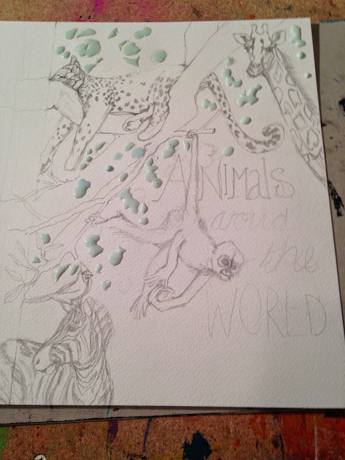


These are the preparatory studies above. I still had a bit of a struggle working out the composition, colour combination and how to incorporate the text. In the end I decided to collage handwritten text on.

Photo of final image

I feel that it may have needed a dash of a light-orangey colour, perhaps from one more bird on the monkey's head but I ran out of time to include this.  I also didn't quite get the facial expression of the monkey as I envisaged because initially I drew it as is from the internet image and then when I was painting it I decided to try make her look like she was smiling....and this didn't quite work alas! 


I tried to use my very basic digital skills and managed to add a few sparkles! big steps for me I tell ya! ; ) Part of me thinks the image works and then part of me is concerned that maybe it's a little boring. I didn't personalise the animals' expressions as I'd hoped because I had wanted this to be subtle but perhaps they're a little too subtle?...I haven't quite decided myself! I do like the tissue paper to add the text because I was just NOT winning on this front. I would welcome feedback and advice! 


Friday, 5 December 2014

Exe 4.2: Museum posters


Brief: You have been asked to produce three illustrations to be used as part of a series of A3
posters to publicise the museum to the following audiences:
Child aged 5–9                            Teenager (13–16)                              General adult audience 

After quite a bit of Ummmmming and arrhing about which museum to choose I decided on Kelvin Grove in Glasgow, after visiting my sister. It truly is an extraordinary museum and art gallery in one and one of the most visited museums in Europe I soon found out. 


I was a little torn between making the posters a recognisable 'family' but decided to go with it because I just felt that the more repetition or recognisable the image in any advertising capacity, the more familiar the advert becomes and human nature has a tendency to be attracted to things that are familiar in some way. 

After making this decision I started grappling with how to put this into practice! I had recently been to the VERY inspiring exhibition of Matisse's cut-outs at the Tate, and decided to use his influence to inspire the posters. 

I found the idea for the children's poster came the most easily because Kelvin grove has a number of examples of taxidermy animals and most famously it houses the Elephant " Sir Roger" and dinosaur skeletons. 


The teenager took more effort and time whereas I found choosing an artefact to appeal to teenagers the most tricky. I found myself choosing articles that were perhaps more stereotypically gender specific and so finally decided on masks as something a little more neutral. I think it helped that earlier I had played around personalising some masks in my sketchbook just playing around so this helped formulate the final idea. 


The adult poster again was a little more tricky and so I decided to go with an artefact that symbolised that the museum is intact also an art gallery and houses some beautiful and prominent artwork from the Glasgow boys to Dali. I settled on doing a 'matisse-like-stylised version of The Dali painting that hangs in Kelvin Grove called: "The Christ of St John of the Cross"

I then got down to working out the colour scheme, doing some roughs and start cutting. 
1. Kids poster: prep and colour prep


Final Kid's poster
2.) Teen poster prep and colour ideas:


Teen Poster Final

3.) Adult poster:

           
Adult poster final
The family of posters:


Do they work? 
I actually really enjoyed the process of using cut-outs! It forced me to focus on shape and colour and stylise my images. The teenage poster was a PAIN to cut-out but apart from that I think it works well as an eye catching poster.  The adult poster is probably the most controversial and perhaps I needed to reference Dali in the poster but I was cognisant of making the poster to busy. This poster is inspired almost directly by an artwork by Henri Matisse and so I'm not sure if this confuses things as he is one artist who is not actually exhibited at Kelvin Grove....apart from the controversy I think the colours work well and I feel like using Matisse's style helped me learn a little more about colour and how colours influence each other when placed next to each other etc. 
I enjoyed making the kids poster the most because it was one of this things where both the idea and the making seemed to flow easily!

Wednesday, 3 December 2014

Exe 4.1: Exploring tools and materials

It was an eye opening experience exploring illustrators and their media. From Wonderful illustrators like Isabelle Arsenault and her use of coloured pencils; to editorial artists like Thea Brown who use pencils to create portraits that are filled with emotion and texture; to watercolours by wonderful artists like Sir Quentin Blake; to the magical work of acrylic artist and mixed media artist, Brian Wildsmith; to the challenging, thought-provoking images created through the process of printmaking by Edel Rodrigues and Daniel Pudles; to the beautiful collage art of Michael Haake and Agata Dudek; to digital artists like Lo Cole and Christ Haughton and to the mixed media artwork of Marion Duchars. 
        
       Here is a taster of some of the artists and their methods that I have discovered: 

Isabelle Arsenault
                                  

I explored the editoral illustrations of Daniel Puddles and his use of woodcuts:
Daniel Pudles is a genius with his woodcuts. His images are effective not only because of his reductive method of printing and his wonderful way of limiting his colour palette so effectively. 
 

I looked at wonderful examples of Collage from Martin Haake: 


Looking at the wonderful Acrylic paintings by Olaf Hajek with his layering and bright colour pallet has challenged me to try acrylic paints as I have a tendency to stick to Gouache.
 

 With all of these wonderful illustrators explored, I decided to try my hand at redoing one of the poster designs that I did for assignment 3 in the style of Daniel Pudles and his woodcutting technique:
A) 
B.)  C.) 

D.)  E.) 


I learnt a lot doing woodcuts for the 1st time. In terms of the process I tried to get the texture of the wood to add to the images the way that Daniel Pudles does, but I didn't manage to achieve this effect at all. I can only put it down to lack of experience and thus the need for practise! I also think that I may need to re-look at the actual wood that I used because it may have not been the quality of wood needed to allow for the woody texture to become part of the image. As a result it meant that although the print was identifiable as a relief print, it really could have been lino or wood and it is difficult to differentiate.

I also made a number of other mistakes and learned a number of lessons creating the prints: 
1.) I needed to plan the prints before hand because the lack of planning resulted in a lack space for the rest of the type that needed to be included. 

2.) I tried to play around with a limited pallet but this didn't always work which is evident in options (C.) and (D.) above.

3.) The other thing I found that was that the prints completed on the blue paper in white i.e : (B.) and (E.) unfortunately lost their colour when scanned but were better when they were photographed. The purple in the text in image (C.) just doesn't work 


In spite of this, I think that the prints are a step forward from the original design. I think the prints that work the most successfully are the green print (A) and white and turquoise point  (B)  


Wednesday, 29 October 2014

Back at it..a few sketchbook moments....

Having recently returned back to the UK, I haven't had much of a chance to start the next section of work but I have managed to do a few sketches in my sketchbook so decided to include them as proof that I have not been sitting idly! ; )


I have finally realised that I am allowed to add colour into my sketchbooks and  this is very freeing! 
 I am beginning to feel a little more comfortable with just diving in and starting to enjoy my sketchbook and use it for random doodles, drawing from life and preparatory studies. 

I finally started reading the next set of work and its all about developing your own style...a journey I am still very much embarking on!