
I am currently studying Illustration through OCA and this is my Learning Log for the course
Tuesday, 10 December 2013
Sunday, 27 October 2013
Draw-24 Brighton
Following advice from my tutor about drawing from life and live drawing, I decided to be brave and take part in our local 'Draw-24' event in Brighton. Draw-24 was organised by a local drawing group aptly called 'DRAW' run by Jake Spicer. (see http://www.draw-brighton.co.uk)
It was organised as a result of the BIG DRAW group who have inspired countries all over the world to get back to drawing!
The blurb on their website (http://www.campaignfordrawing.org/bigdraw/) reads like this:
Back in Brighton we were invited to drop in for slots or if you were able to, to stay for the whole 24hours! I unfortunately was not able to commit 24 hours but managed to join for the 1st slot that started at 11:00 this morning.
We were going to be drawing in charcoal, which I am new to using. I had some anxiety about drawing in public, despite the fact that everyone was totally focused on their own drawings, as well as using charcoal. With some encouragement from the organisers I quickly got into it and forgot myself in the motion of drawing. I really enjoyed working on a larger scale as well as collaborating with others to form a doodle-like visual representation of symbols of Brighton. I found myself becoming more and more relaxed without the fear of 'end-product-failure', and I don't think I was alone in this. At the end of it we had a slightly random collection of drawings which echoed the energy and fun-loving randomness that Brighton offers.


The final 24hours looked like this:


 With walls and floors and tables now decorated, Draw 24 was a great success!
It was organised as a result of the BIG DRAW group who have inspired countries all over the world to get back to drawing!
The blurb on their website (http://www.campaignfordrawing.org/bigdraw/) reads like this:
It’s Big Draw Time!
The 2013 Big Draw runs from 1 October to 3 November in fifteen countries, with more than 200,000 people of all ages expected to take part in 1000+ events. Hundreds of new and enjoyable drawing activities connect people of all ages with museums, outdoor spaces, artists - and each other. These events are for those who love to draw, and those who think they can't.
Back in Brighton we were invited to drop in for slots or if you were able to, to stay for the whole 24hours! I unfortunately was not able to commit 24 hours but managed to join for the 1st slot that started at 11:00 this morning.
We were going to be drawing in charcoal, which I am new to using. I had some anxiety about drawing in public, despite the fact that everyone was totally focused on their own drawings, as well as using charcoal. With some encouragement from the organisers I quickly got into it and forgot myself in the motion of drawing. I really enjoyed working on a larger scale as well as collaborating with others to form a doodle-like visual representation of symbols of Brighton. I found myself becoming more and more relaxed without the fear of 'end-product-failure', and I don't think I was alone in this. At the end of it we had a slightly random collection of drawings which echoed the energy and fun-loving randomness that Brighton offers.

Overall view of our images as the group to start Draw 24 off


My contribution is the seagull and text "This is my hood"..aimed at echoing Brighton's street art and of course the seagulls who run the place; as well as the beach huts top right corner, representing Hove...where I live!... and an inaccurate map in the centre whih forms more of a pattern then anything else!

Left of the image my contribution is really only the coffee cup, text and pebbles.
This was a really great way to spend 2 hours and by the end of it all three of us had lost all performance anxiety and were simply going with the flow!
I think the final large scale doodle of brighton is effective especially as it echoes the fun that we were having and has has three quite different styles of drawing combined in one image. I think that on this scale it also worked that it was a tonal drawing on the brown paper i.e.: using charcoal, white chalk, and white and greeny-grey acrylic paint as it may have got a little too overwhelming for the viewer if there was colour as well.
The final 24hours looked like this:


Thursday, 24 October 2013
Sunday, 13 October 2013
Inspiring talks from active illustrators
I've been lucky enough to manage to see three accomplished illustrators present their latest books in the last three weeks.
The first I saw was was Oliver Jeffers at the Southbank. The auditorium was filled with fellow admirers hanging on his every word. A few key things stood out for me about Oliver Jeffers:
a.) He is a natural at self promoting but does it in a way that you is subtle and quite genius!
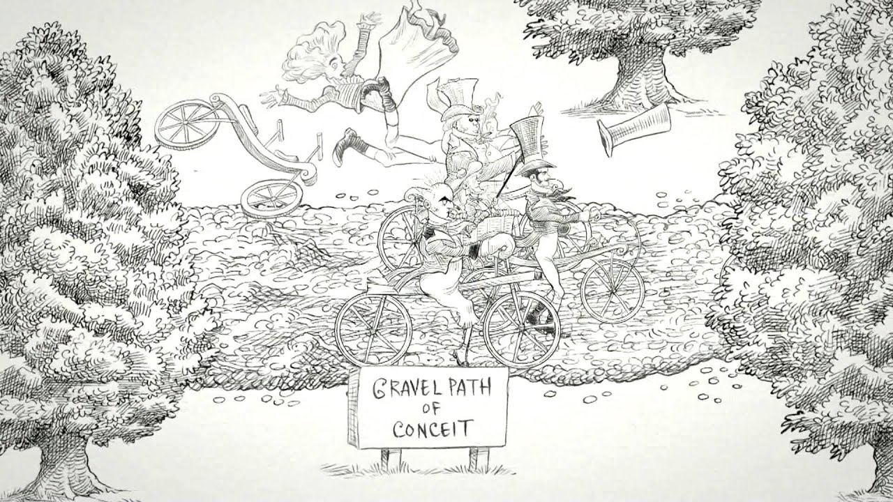
b.) He commented on how he often makes use of contrasting scale to convey a message in an image, as seen in the image below.
c.) He has a great way of including humour in all of his images, especially in his picture books.
d.) It is great to see that he has been brave enough to step out of the box of being confined to one form of art and or be labeled solely as a children's book illustrator, but in stead has launched himself into the fine art world as well as advertising and editorial commissions. Although his style is recognisable in all these forms and some images work better then others, it is encouraging to see him venture into a number of areas of visual communication.

He was great to watch and I could't help but purchase the latest book that he has illustrated , " The day the crayons quit', written by Drew Daywalt.
Oliver Jeffers uses his own typography to add to the humour and childlike essence which makes it popular with children and adults alike.

The next 2 author/illustrators I saw at a local children's bookshop in Hove, called "The Booknook".
The first was Chris Ridell who has written and illustrated a new book called, " Goth Girl". It was great seeing how he interacted with the children who made up the majority of the audience.
His illustrations are all in black and white and very delicately produced. He makes beautiful use of cross hatching within his drawings and his characters are expressive and creative. He also seems to have an in depth knowledge of form and movement of both animals and human beings alike which is evident in the way that he forms his characters. Finally he also appears to base much of his work on elaborate research both from his life, historical facts and the world around him, and he uses this research to add colourful details to his images and his narrative.

 Chris Ridell who is also a prolific illustrator for the Guardian was remarkably encouraging to the children and adults alike and I left feeling quite inspired.


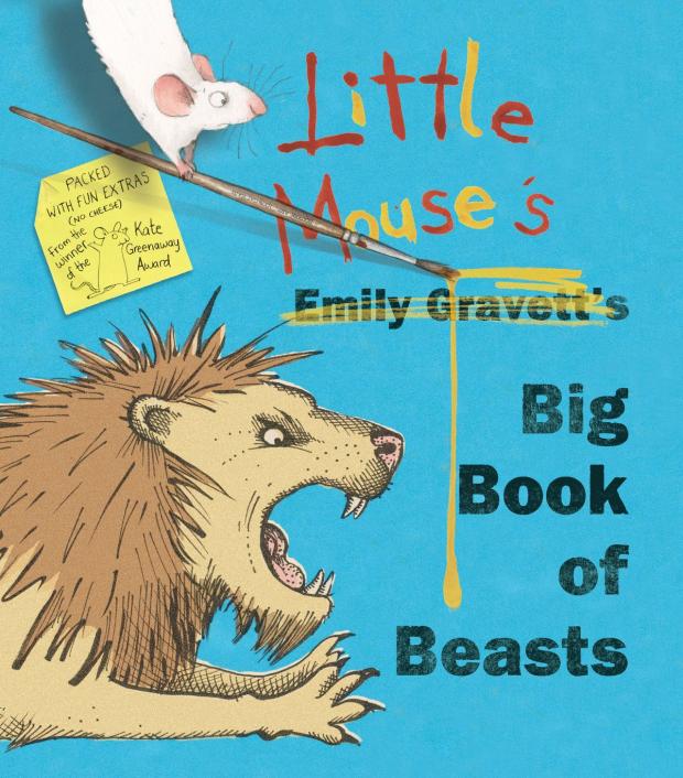
The last author/illustrator I saw at the 'Booknook' was Emily Gravett.
She is also one of my favourite illustrators having created masterpieces like 'wolves' and 'Little mouses big book of fears'. Her illstrations are full of life and expression. She makes wonderful use of mark making and also makes use of contrasting scale, as well as cropping her images and drawing her characters from unique angles.


She too has brought out a new book:

The first I saw was was Oliver Jeffers at the Southbank. The auditorium was filled with fellow admirers hanging on his every word. A few key things stood out for me about Oliver Jeffers:
a.) He is a natural at self promoting but does it in a way that you is subtle and quite genius!
b.) He commented on how he often makes use of contrasting scale to convey a message in an image, as seen in the image below.
c.) He has a great way of including humour in all of his images, especially in his picture books.
d.) It is great to see that he has been brave enough to step out of the box of being confined to one form of art and or be labeled solely as a children's book illustrator, but in stead has launched himself into the fine art world as well as advertising and editorial commissions. Although his style is recognisable in all these forms and some images work better then others, it is encouraging to see him venture into a number of areas of visual communication.

From the Book, Lost and Found
He was great to watch and I could't help but purchase the latest book that he has illustrated , " The day the crayons quit', written by Drew Daywalt.
Oliver Jeffers uses his own typography to add to the humour and childlike essence which makes it popular with children and adults alike.

The next 2 author/illustrators I saw at a local children's bookshop in Hove, called "The Booknook".
The first was Chris Ridell who has written and illustrated a new book called, " Goth Girl". It was great seeing how he interacted with the children who made up the majority of the audience.
His illustrations are all in black and white and very delicately produced. He makes beautiful use of cross hatching within his drawings and his characters are expressive and creative. He also seems to have an in depth knowledge of form and movement of both animals and human beings alike which is evident in the way that he forms his characters. Finally he also appears to base much of his work on elaborate research both from his life, historical facts and the world around him, and he uses this research to add colourful details to his images and his narrative.


The last author/illustrator I saw at the 'Booknook' was Emily Gravett.
She is also one of my favourite illustrators having created masterpieces like 'wolves' and 'Little mouses big book of fears'. Her illstrations are full of life and expression. She makes wonderful use of mark making and also makes use of contrasting scale, as well as cropping her images and drawing her characters from unique angles.

Illustration from her book Wolves
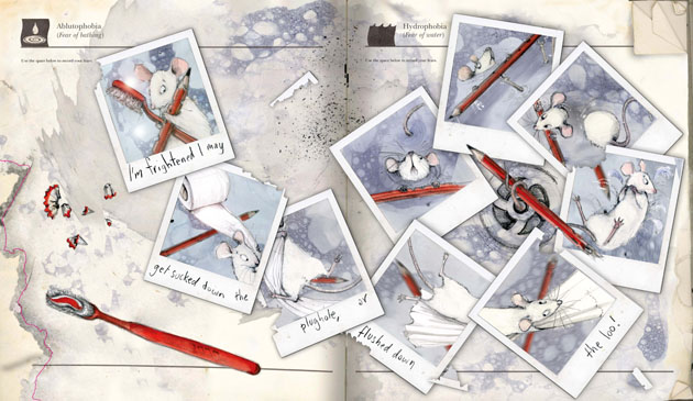
From her book Little Mouse's big book of Fears
What an experience to shake hands with some of the artists that I admire. It was inspiring to meet them all....as fleeting as our meeting was!
Tuesday, 8 October 2013
Shaun Tan invites you into his studio
Shaun tan is one of my all time favourite illustrators. I love the way he manages to explore difficult themes visually and so creatively. I also love the way he uses a variety of materials and mixed media. I think he is a wonderful artist. This is a short interview with him in which he gives us a small glimpse into how he creates. With books like The Red Tree, Tales from Outer Suburbia, The Lost Thing and The Arrival, Shaun Tan is certainly one of the reasons I was drawn to illustration.
Tuesday, 1 October 2013
Brighton Street art
One thing I love about living in Brighton is the street art! Everytime I walk through the North Laines I am amazed at the skill and colour!

It's even exhibited in some of the local coffee shops!


It's even exhibited in some of the local coffee shops!

Assignment 2: Summer and Autumn Fruit and Veg point of Sale
Well I finally got to assignment 2 and wrote the majority of my reflections in my paper learning log so to prevent duplication I will keep this blog post as succinct as possible!
The purpose of the final assignment was to create a point of sale image, 12"x12" for an upmarket supermarket. The brief was to create an illustration of fruit and veg for Summer and for Autumn based on direct observation and then to create separate images for Summer and Autumn that reflect both the produce and aspects of the seasons as well.
I forgot to photograph my individual summer and autumn fruit and veg observational images before sending them off to my tutor so have concentrated on the point of sale seasonal images in this blog post at the moment.
1.) SUMMER:
I found everything to do with the creation of a summer image far easier then Autumn especially from an idea-generation point of view. A few ideas sprung to mind immediately and helped feed the image:
a.) whenever I think of Summer I think of the song, 'Summertime' from the Opera Porgy and Bess.
b.) I wanted the image to look fresh and abundant
c.) I wanted to use some of the information that I had learnt from looking into the history of food in painting in my image.
d.) I wanted it to be colourful as summer reminds me of colour!
What did I do:
1. I brainstormed and then collected pictures that reminded me of summer and summer fruit and veg and made a moodboard.
2. With the brainstorm I worked out a few rough sketches and decided I wanted to incorporate text in the form of fruit and veg therefore alluding to the seasonal images of Guiseppe Archimboldi while hopefully making it contemporary. This also meant that I could use the words of my beloved song Summertime! To counteract the length of the word Summertime I decided to symbolise time by an exclamation mark made out of Thyme. (....I don't know if that comes across as I had hoped but I had a chuckle to myself! ; )
3. After completing a few rough versions I decided to do a preliminary version in Coloured pencil to see if it was going to be too busy in colour and to work out the composition.
When I was happy with the coloured pencil version I completed the final image in watercolour...... all seemed to be sailing but before I started the final artwork I decided to re-read the brief just one more time...and low and behold I realised I was about to make a monumental error as the brief specifically asked for an image that was 12"x12" (or that scale) .....ie: A SQUARE versus the RECTANGLE that I had composed my image to fit.
 |
| O mannnnnn....it's a square not a rectangle!!!!! ... to panic or not to panic? |
Here are the images:
 |
| Coloured pencil preliminary A4 sketch....rectangle...... |
Final watercolour square image drafts(18"x18"):


 | ||||||
| Final Watercolour summer image, 18"x18"
How do I think/feel about this and how well did it go?
1.
I think overall the image works. It is quite
busy though, so some may feel it is a bit too much... I hope however that it illustrates abundance of summer fruit and veg though while contrasting with the relative calm of the green and white in the text below which I was trying to use to balance out the business.
2.
I do think that perhaps the image is better
suited to the ‘rectangle’ composition vs. a square in terms of being able to read the word summer immediately, but I think that it still
works as the square image.
What did I learn?
1.
Apart from making sure I READ THE BRIEF, I
became more used to using watercolour paints thanks to this assignment and the
experimentation leading up to the assignment.
2.
I also learnt that a square is very different to
a rectangle! …sounds obvious but trying to space things that fit into a
rectangle into a square is certainly a challenge.
3.
I also discovered that inks actually ‘splat’
better for me then watercolours! (whether this is just me or intrinsic to the
material I am not sure.)
4.
I also decided to do the image to scale i.e.:
18”x18” thinking this would be easy to scan in and get a 12”x12” copy printed
but unfortunately the two local print shops in my area were unable to do this
for me as it was larger then A3 which is their largest flat scanner and I was a
little nervous to put it through their ‘roller scanner’…especially for the
price they were going to charge me for one copy. I guess in a commission
situation I would need to clarify if making things bigger would cause problems
etc.
5.
I learnt that watercolours aren’t as scary or theoretical as I had assumed and so am
more open to use them now as a result of this assignment. I have learnt that
they are NOT a quick medium though.
How have I put theory into practice?’
1.
I have tried to consider all the experiments and
explorations with paints and paper in order to make a considered decision about
the materials I chose to use for this image. i.e.: I chose to use watercolours
for their translucence and bright colours which I feel echo freshness and summertime.
2.
I also chose to have a predominantly white
background again to echo bright summer and keep it fresh.
3.
I used the idea of playing with imagery by using
thyme to stand in for ‘time’ in the image. Although this is not metaphorical
exe 2.11 explored how words and images can be playful and engage viewers to
look more closely when reading or seeing images.
4.
I drew on influences from Guiseppe Archimboldi
after reading about him in ‘food and
painting. I also tried to ensure that the principles of making the fruit
and veg stimulate appetite while also showing abundance that was spoken about
in Food in Painting.
How does my current practice lead to me becoming better at a
skill?
I
feel that this using watercolours in the summer image has opened my eyes to the
versatility of this paint so I will consider using them more in the future now
that I have had a chance to experiment with them
How can I use this to plan for the future?
I
quite enjoyed experimenting with food imagery and may perhaps continue to do
so.
AUTUMN
Autumn unfortunately did not come as naturally and therefore was a little bit of a 'race to the finish-line' and I think the image suffered for this reason.
I think one of the reasons that I struggled with the Autumn image is that unlike Summer which I associate closely with fruit and veg, Autumn I immediately associate with red, orange and yellow falling leaves and, unfortunately the pending winter that comes just after autumn! As a result of this I procrastinated and procrastinated and when push came to shove I had to plan as I went along.
What did I do?
1. I panicked!
2. I wanted to include text into the image but unlike summer, no songs came to me and Google was not much help either!
3.I finally settled on Keats’s poem “ To Autumn” which a friend of mine reminded me of. Whether it needed it in the end is arguable but I stuck to my guns to try and make it a little different. I experimented with painting veg that I associated with Autumn after collecting various images from the internet. Unfortunately it was not as easy to draw from life as there are no autumnal veg in season currently.
4. I experimented with using watercolours but abandoned watercolours as a medium as the translucence that I had wanted for summer, I no longer wanted for autumn. For me autumn symbolizes layering and the introduction of blankets and storing and preparation. I therefore wanted a richer less ‘fresh, juicy’ look and so experimented with collaging marrow and trialed painting on wood with quick-drying oils.
5 . I decided to experiment with painting on wood for the final image as I felt that the textures that the wood created felt organic and cozy and naturally autumnal. I soon learnt that this was probably a mistake on many levels!!!!!!!!! Firstly I only had a cheap piece of pine so there is only one area where the wood becomes part of the image. In all other areas it is largely unnoticeable. Also the wood that I had chosen had a horizontal ridge in the middle of it which initially I thought would add to the image by making it like a wooden fence or something(…..yeah not quite sure why this seemed a good idea at the time) but needless to say the horizontal line separated the background and foreground significantly adding to the disunity and lack of harmony within the image. I only realized this when I placed bits of paper over the line and the background and it immediately worked better. My biggest mistake was that the experiment with the quick drying oils didn’t work but I put this down to the fact that I have no idea how to use oil paints and that the ‘quick drying’ were not quick drying enough thus blaming the paint and my lack of skill completely for the fact that the experiment didn’t work and forgetting that the wood may also have had a role to play in the fact that the experiments didn’t work and were thus abandoned.
6. As mentioned I struggled to generate an idea that I was happy with and as time was running short I had no choice but to just launch into it and see if it worked. Needless to say the first image did not work! In theory I felt it had to work as I was using mixed media and collage and wood and paint and….it was all toooooo much!
7. I took a short break from the image and then after experimenting with placing various papers over the text and the leaves that I had created, I felt that the primary problem lay in the background and that I could salvage the fruit and veg in the foreground.
8. I trailed using some patterned paper that I had, but for fear of not making it another overwhelming busy mess, I decided to go with brown paper for the background. I also felt that brown paper is affiliated with fruit and veg as it is often used to wrap fruit and veg in traditional shops and therefore suggest an earthy, down to earth feeling to autumn. Again, I learnt about background materials the hard way as the brown paper I used, which had in fact been a brown paper bag in its previous life, was not really created to be painted on or have pastels on it or ink on it without simply over emphasizing the horizontal lines within the paper. Needless to say, the integration hat I had hoped to do between the background and the foreground could only be done digitally using my very limited digital skills and program on my mobile phone! This is definitely something I will have to look into
9. After coming to the conclusion that I would just have to put up with the background for lack of time (or inspiration) I experimented with writing a few bits of text to include my lines from Keats and decided I had had enough!
Autumn images:
|


Exercise 2.12: Visual Metaphors
The aim of this exercise was to collect examples of images that were metaphorical and then do a few rough sketches to describe either broken relationships, reaching retirement, dreams of romance, high achievement, censorship of the press or economic catastrophe. I chose to illustrate broken relationships.
I have scanned in the pages of my paper learning log so will keep comments brief and hopefully the images will speak for themselves.


My rough sketches for Broken relationships:


Reflection:
Visual Metaphors
Overall:
I enjoyed this exercise and found that I was able to be a little more carefree
without having the pressure of worrying about visual accuracy.
What
did I do?
v I brainstormed ideas around broken
relationships and particularly tried to think about relationships or
partnerships that we generally associate together like strawberries and cream,
bacon and egg, chair and table, cheese and wine, horse and carriage, salt and
pepper or knife and fork. My thoughts were that if I could somehow illustrate
that their relationship was broken or ended this could symbolize any other
broken relationship. I was however only really successful in coming up with an
image for knife and fork.
v I also tried to play around with
text using it as the image itself.
v I also tried to depict a suitcase
being packed with not only men’s clothes but also half of the items that one
would usually share in a happy relationship…things like half a teapot, half a
toaster and half of a DVD player…. I’m glad I wasn’t concerning myself with
visual accuracy in this particular scenario!
v I noted the power of speech bubbles
from some of the resources that I collected so I tried to echo their use in a
few examples of broken relationships. I didn’t quite get there with them but I
enjoyed using them.
How do
I think/feel about this? How well did it go?
v I think that I got the gist of
exercise and when I showed the images to a few family members they were able to
identify with what I was trying to get at. The images that seemed to
communicate the easiest to those I asked were those of the knife and fork and
the disintegrating word relationship. All the others images needed a few
explanations and then they assured me they understood them completely! ; )
Perhaps they were trying to appease me……
What
did I learn?
v I learnt a lot from the images that
I found in a variety of editorials and postcards. They reminded me of the power
of symbols instead of stating the obvious in order to challenge the audience to
read the visual image.
What
and how would I do it differently?
v I would have liked to continue the
exercise and perhaps take photographs of things like broken glass forming the
word relationship or tear up photographs or a single photograph with scenes
that depict happy relationships.
v I think I have only touched on the
visual brainstorming step in this ‘broken relationships’ chain and if time
allows would like to brainstorm further and perhaps create some finished images.
Subscribe to:
Comments (Atom)